C
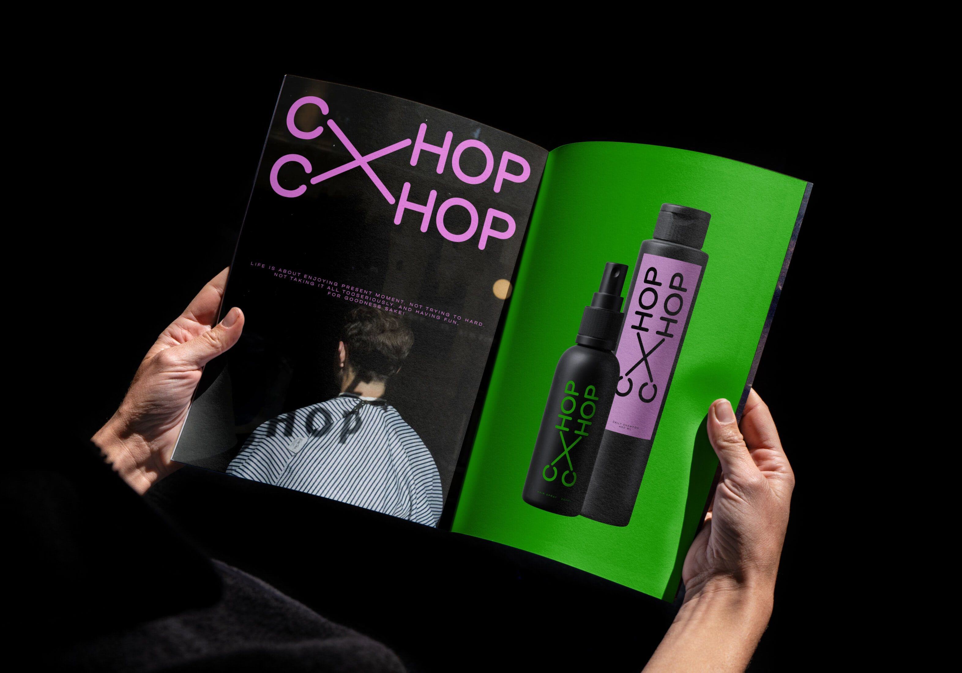
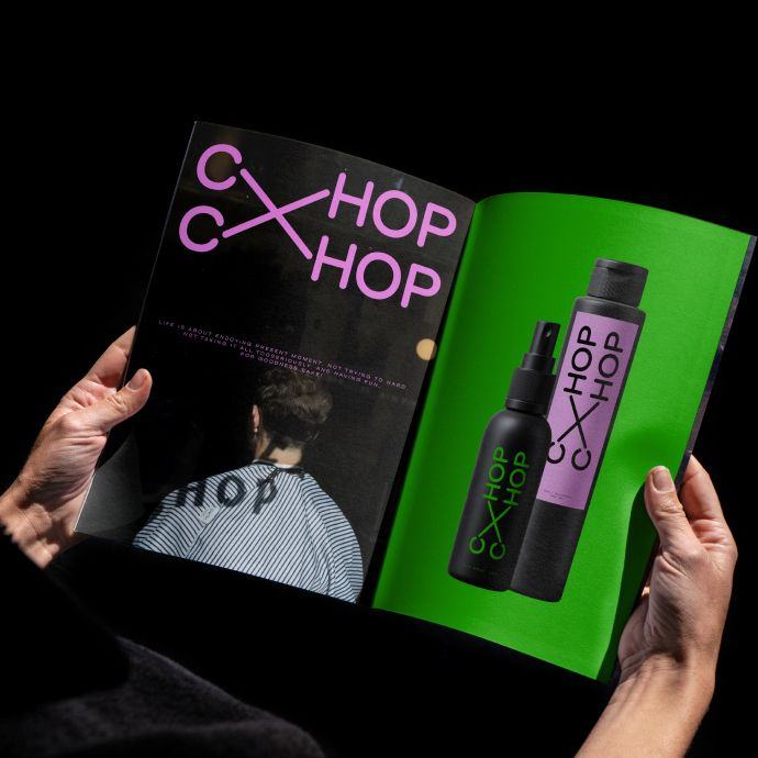
Brand reincarnation for Chop Chop, one of the biggest barbershop chains in the CIS region, featured in GQ and New York Times.


New Chop
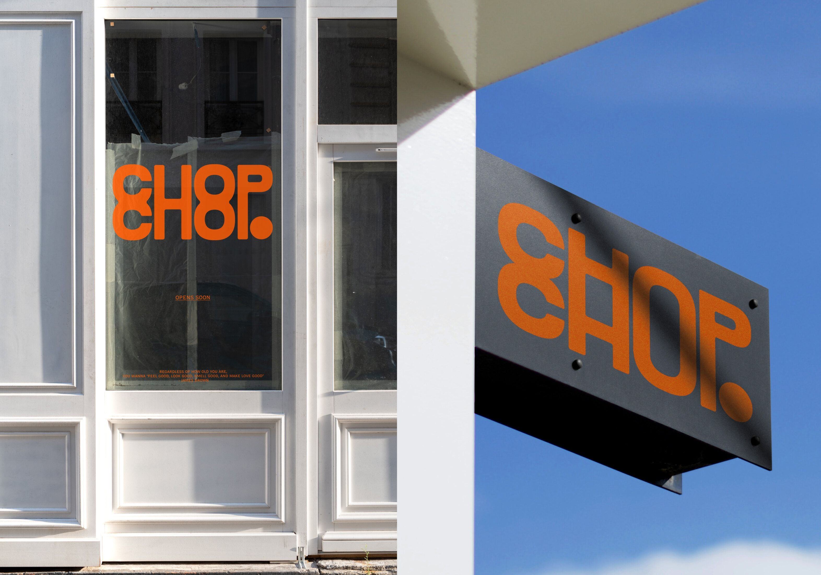
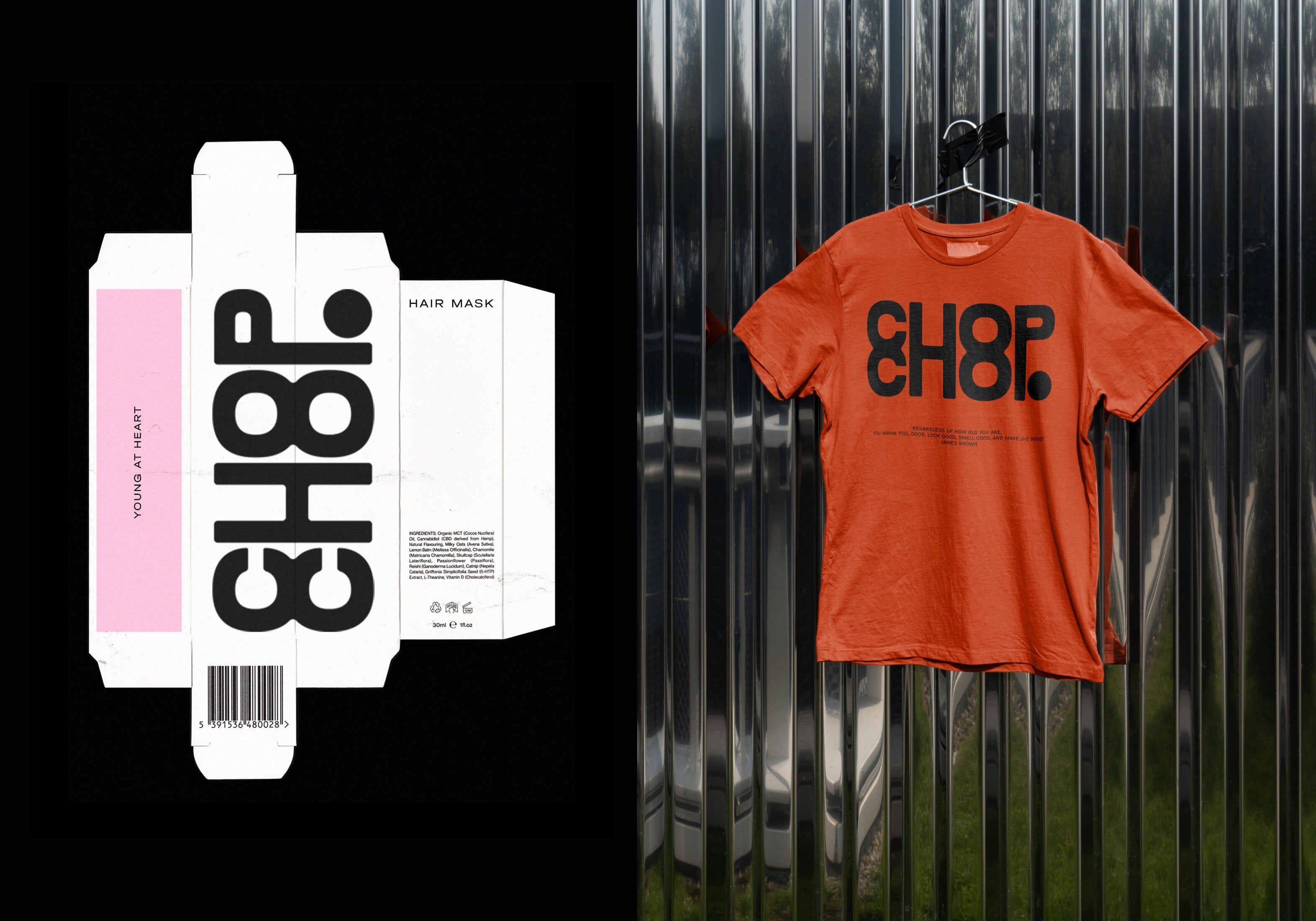
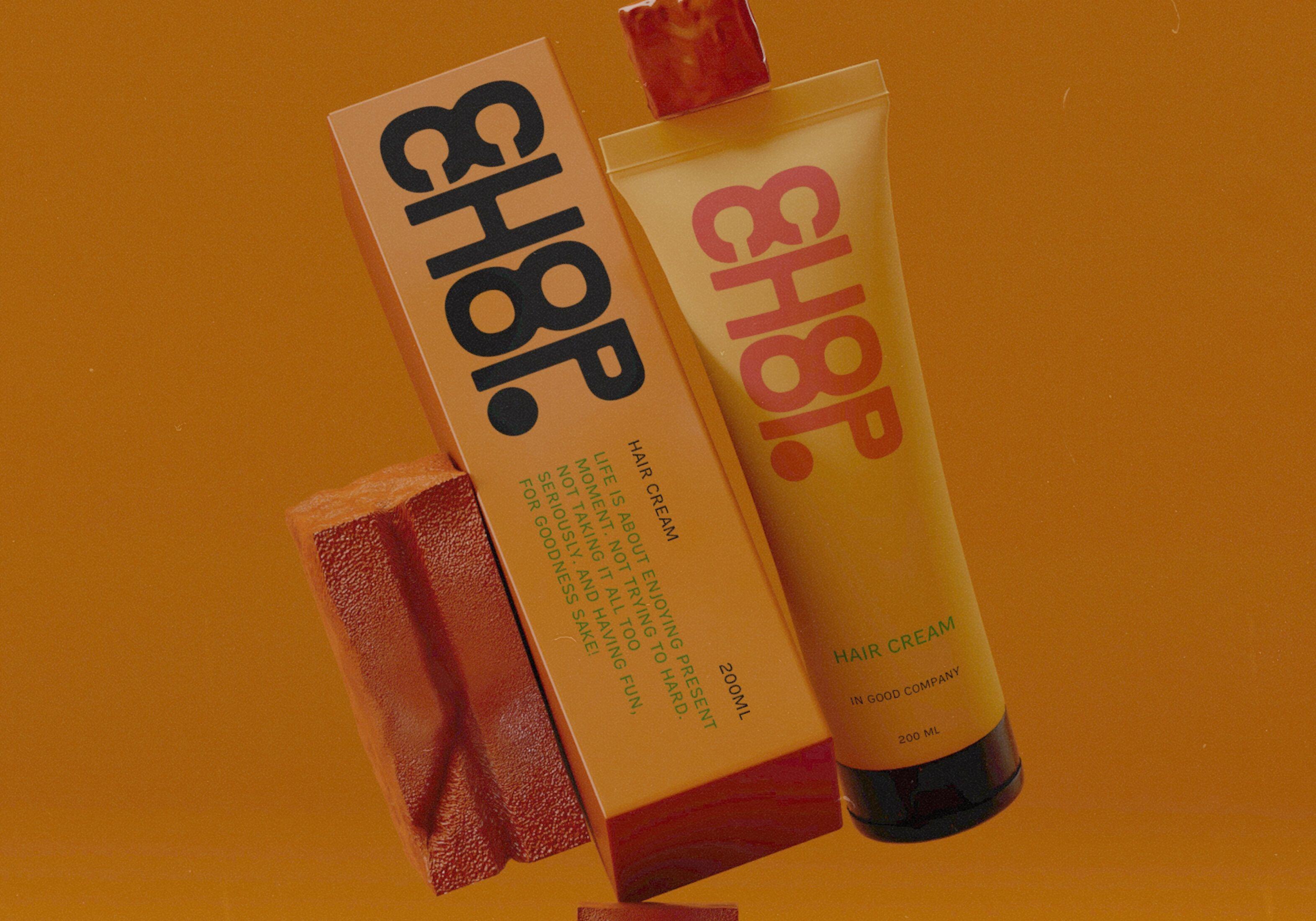
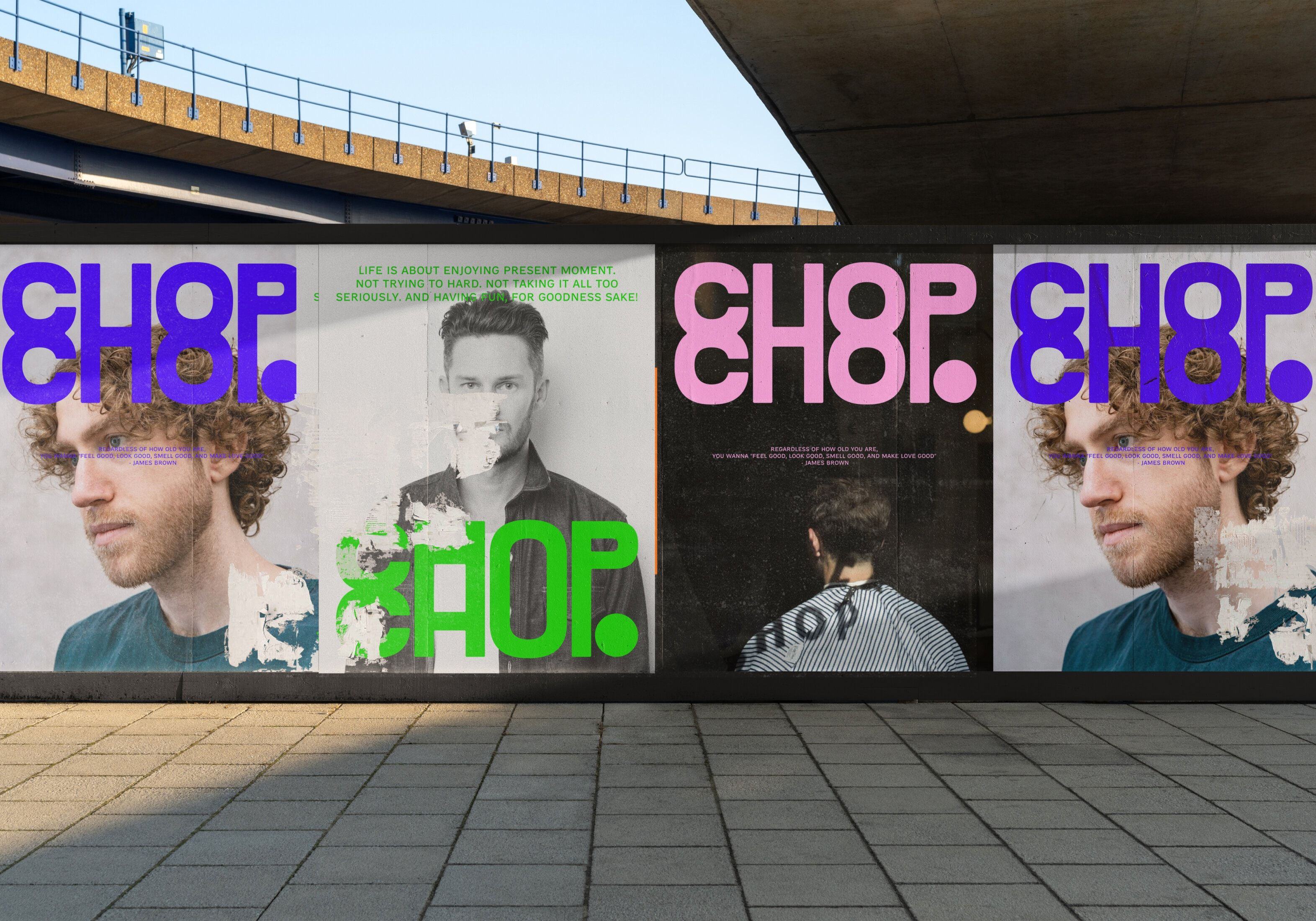
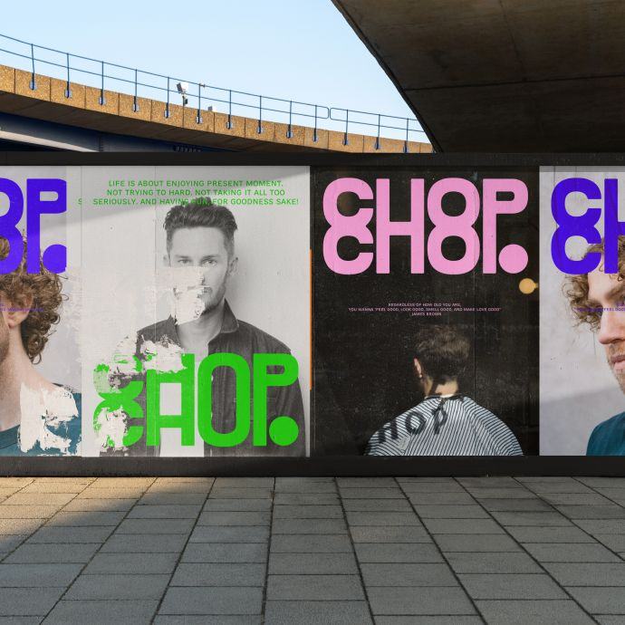
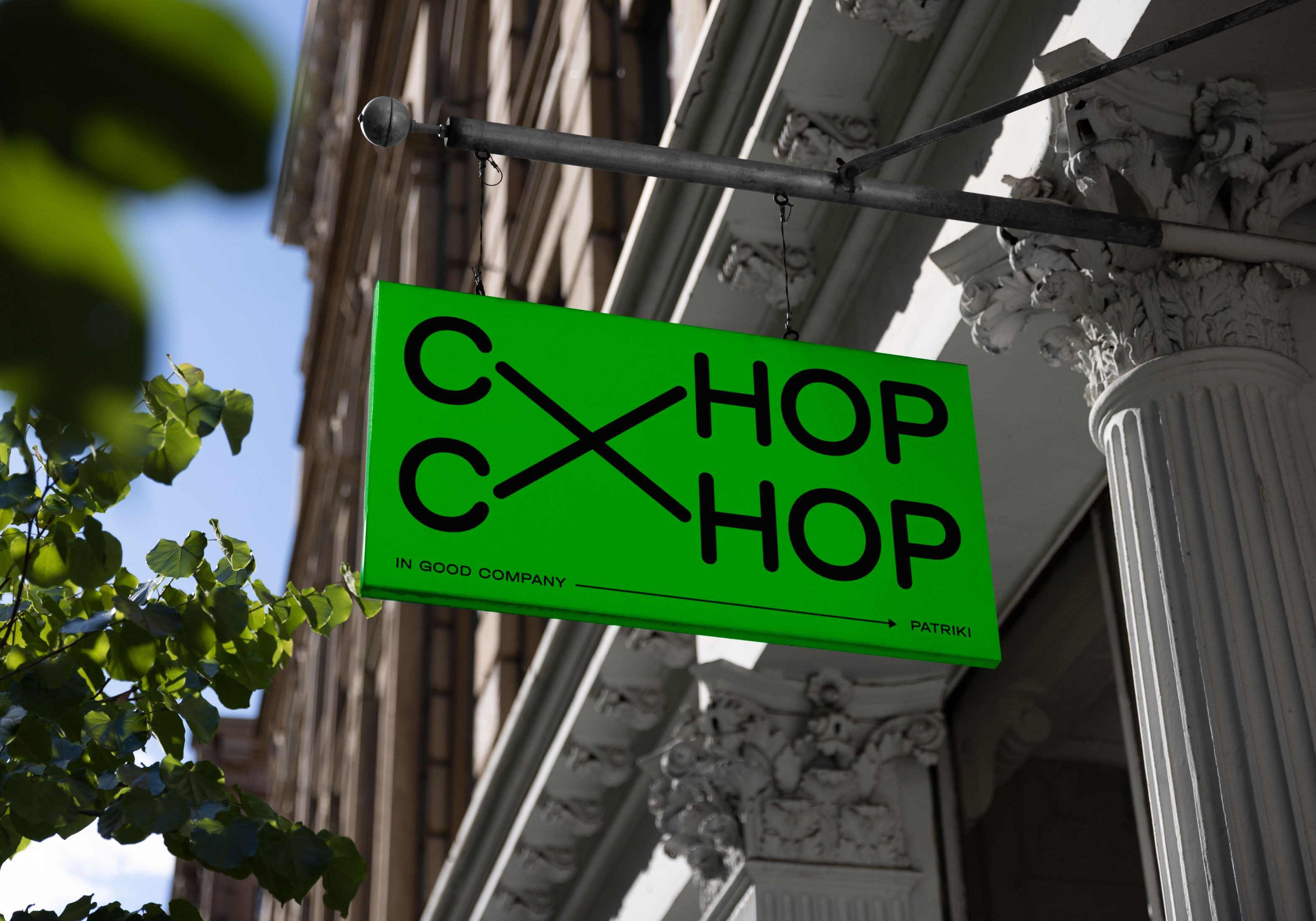
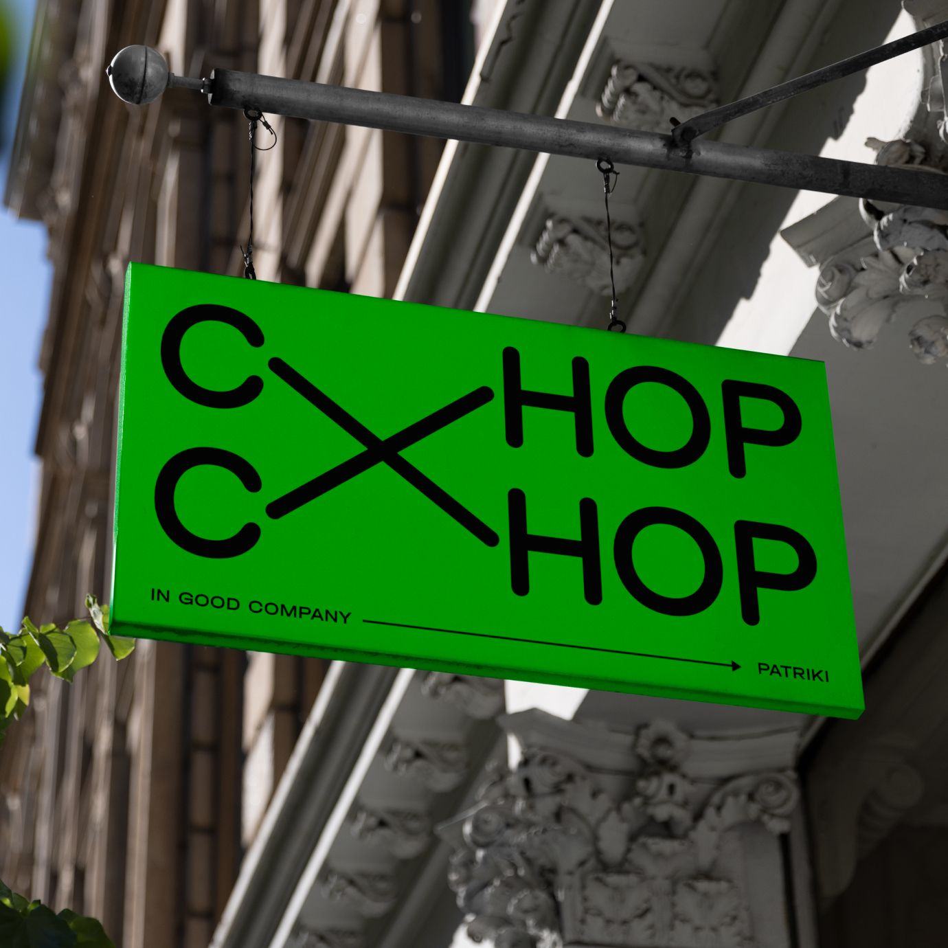
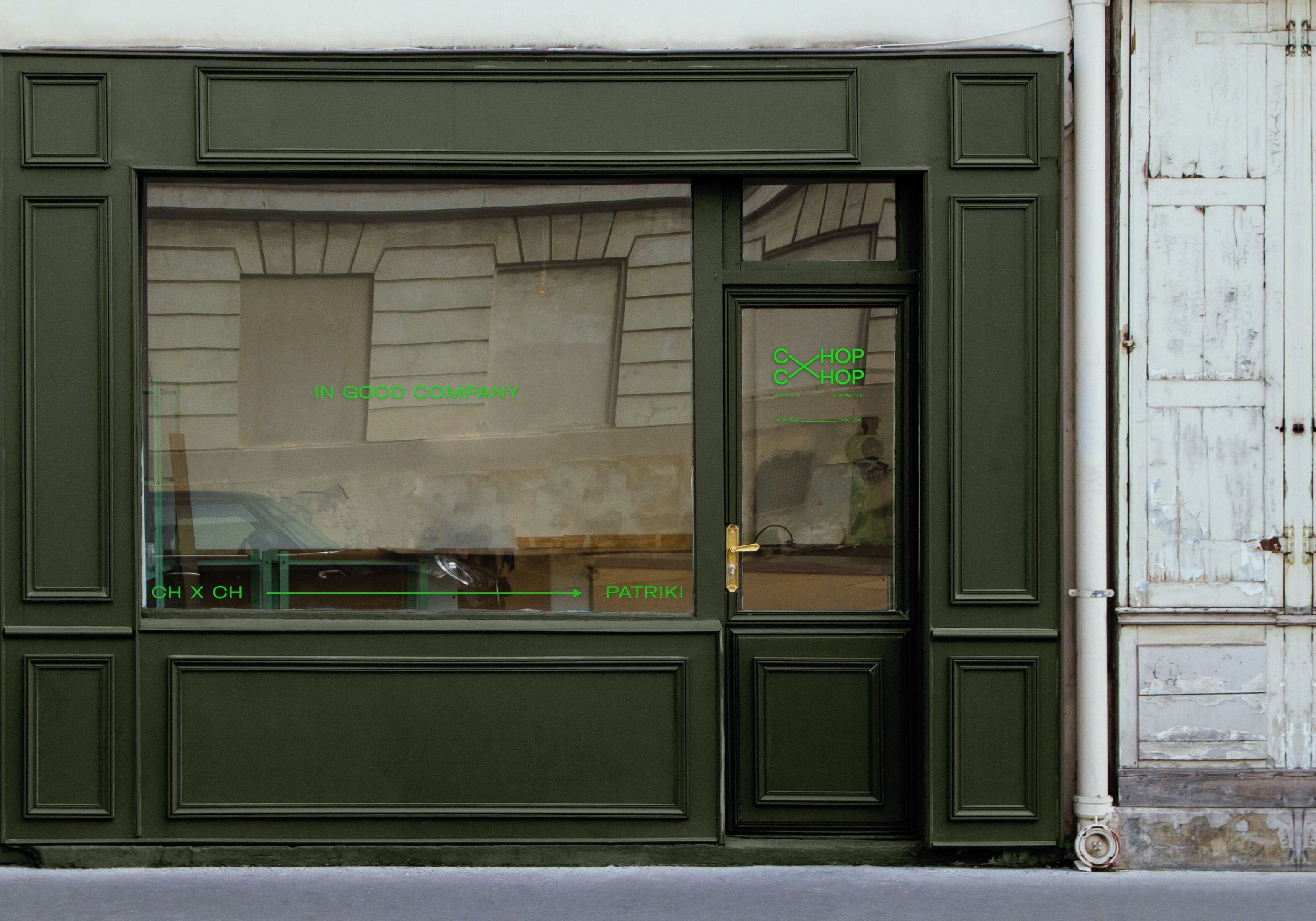
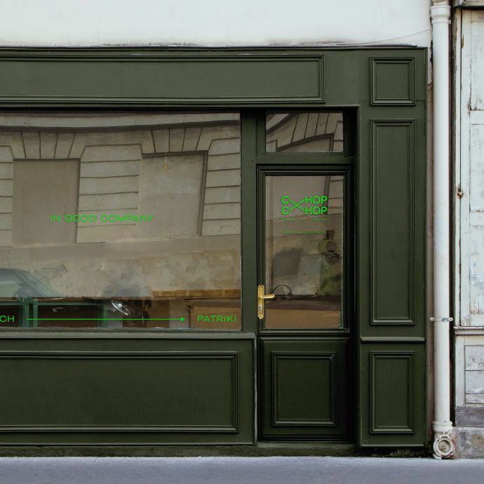
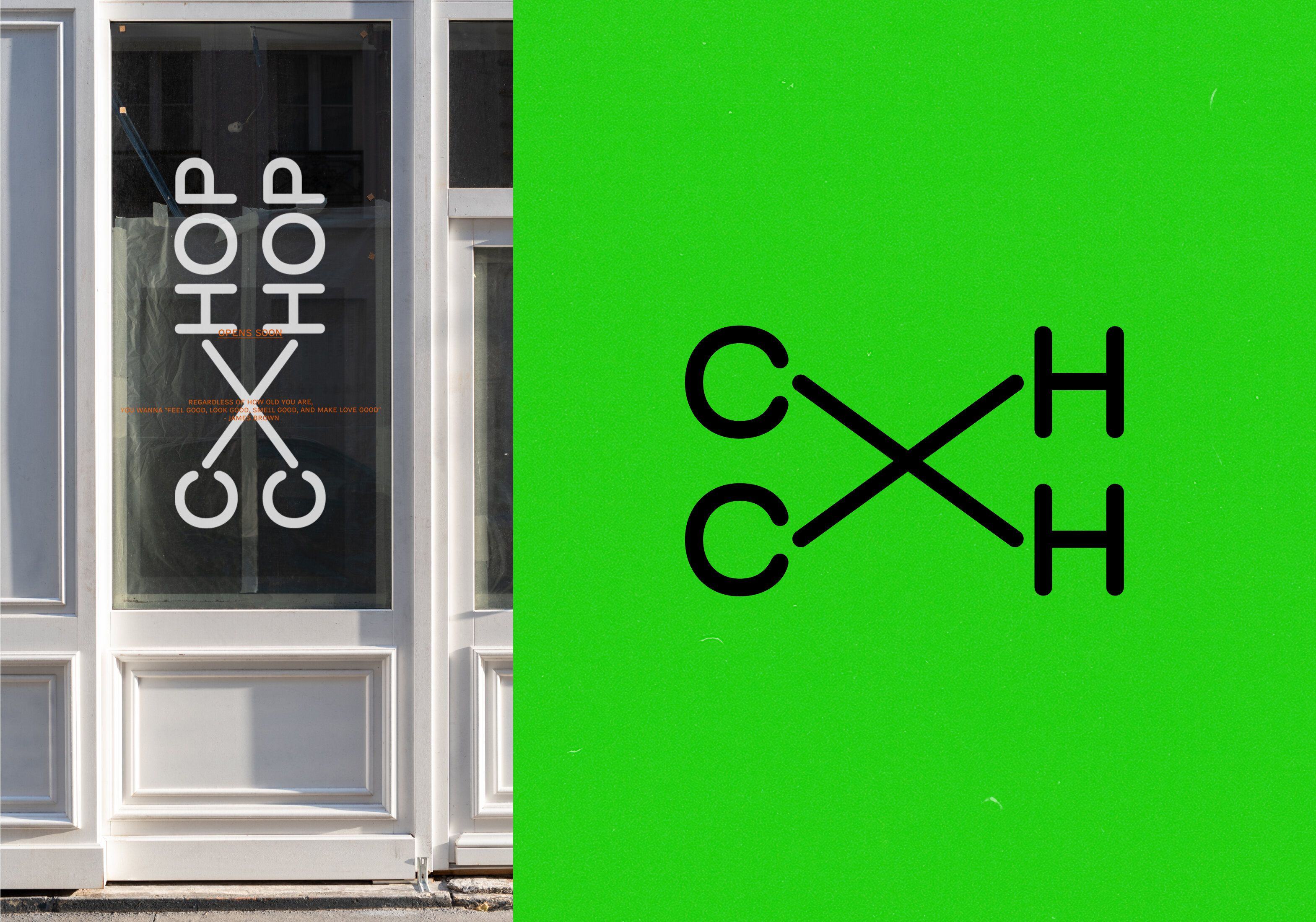
Since opening its doors a few years ago, Chop Chop has grown to over 90 locations worldwide, from Novosibirsk to Limassol. With that growth came the need to evolve the original branding. Self was invited to develop a commercial identity that could travel: across continents, cultures, and audiences, without losing the brand’s original spirit. Trademark hurdles also meant the new logo couldn’t be immediately readable as “Chop Chop”, which was a fun challenge.
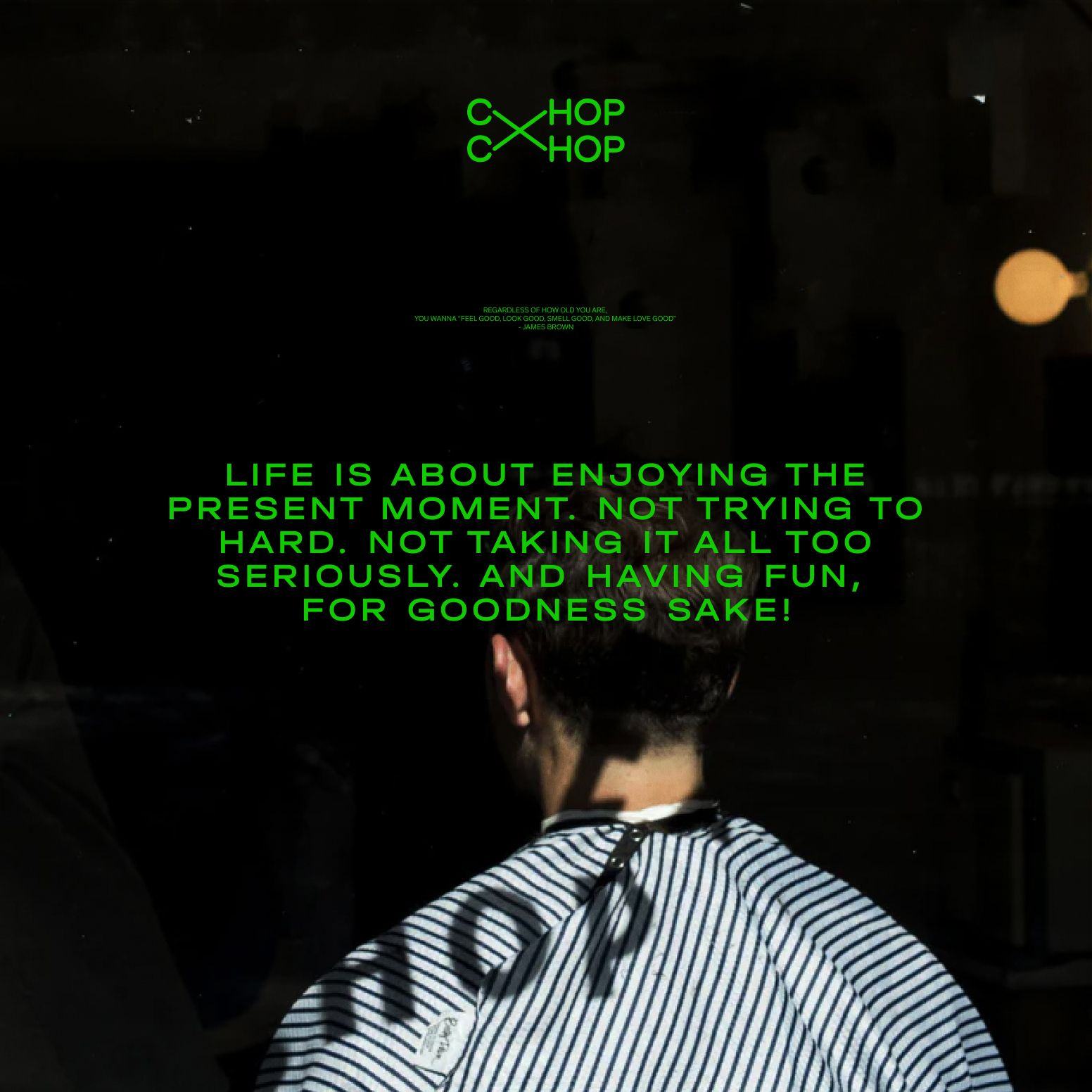


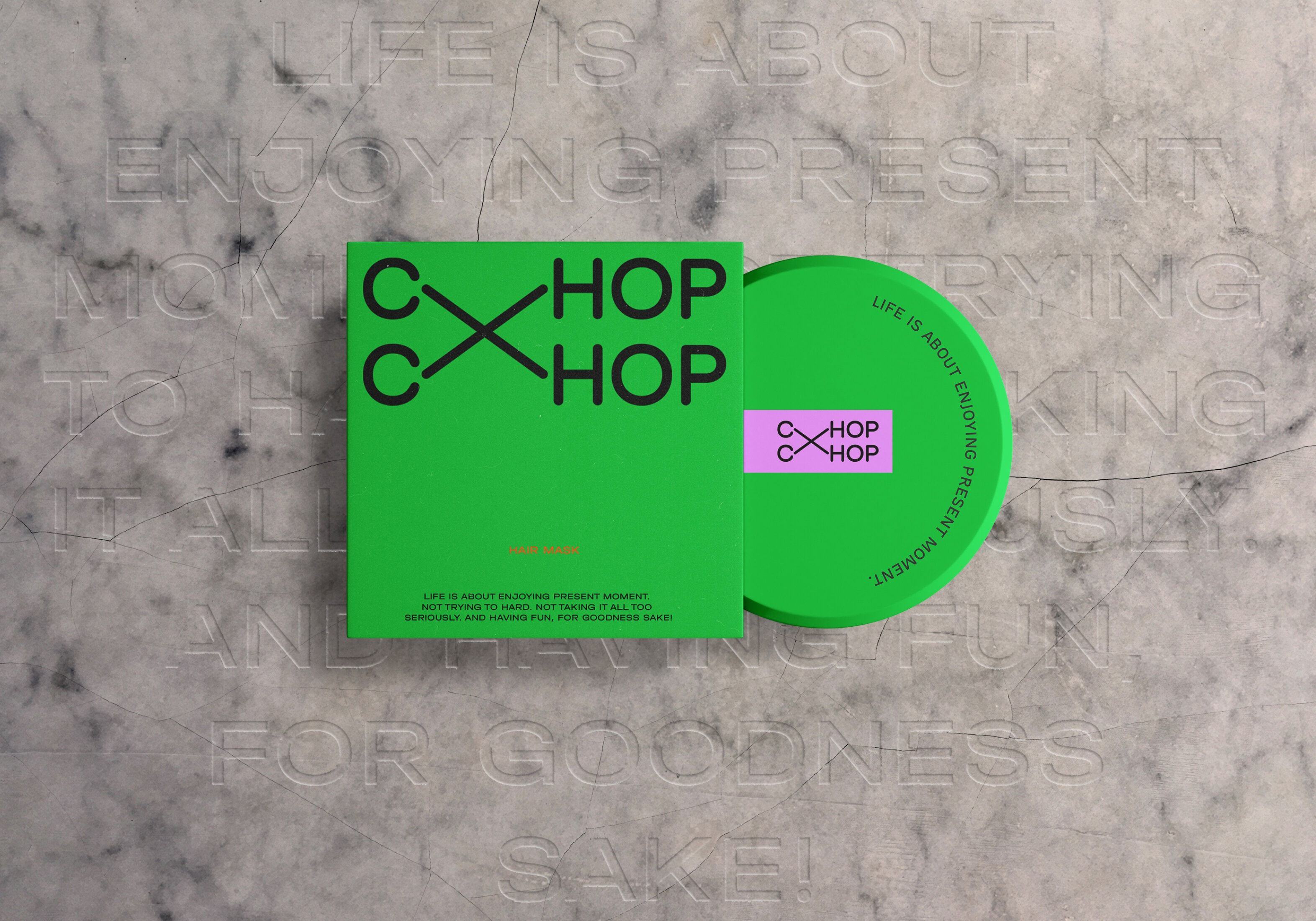
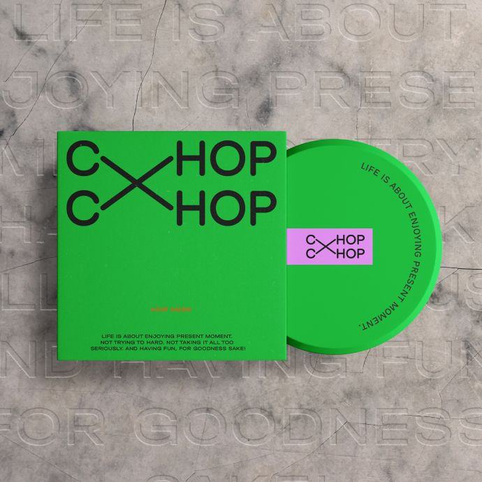


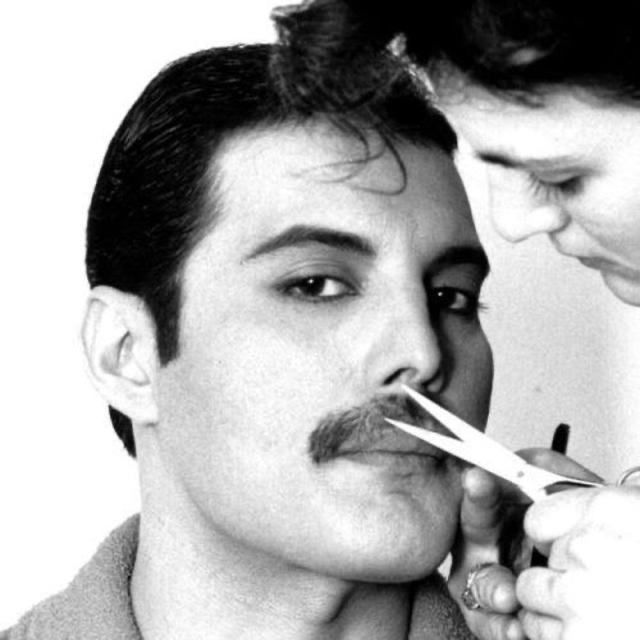
Another Chop
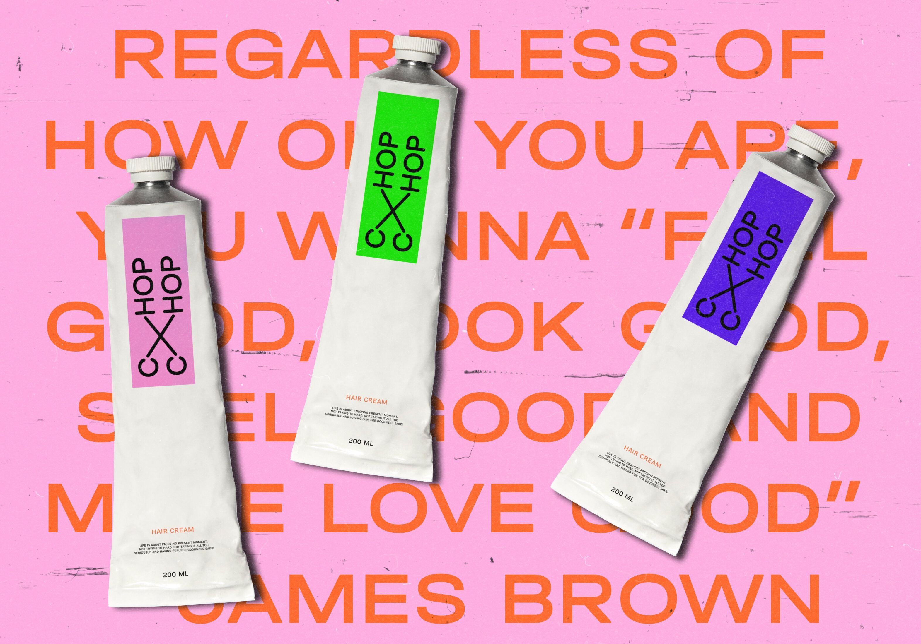
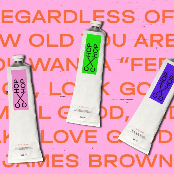
Here’s another take we’ve been holding onto. It never quite made it out into the world, but it held a special place for us back then.