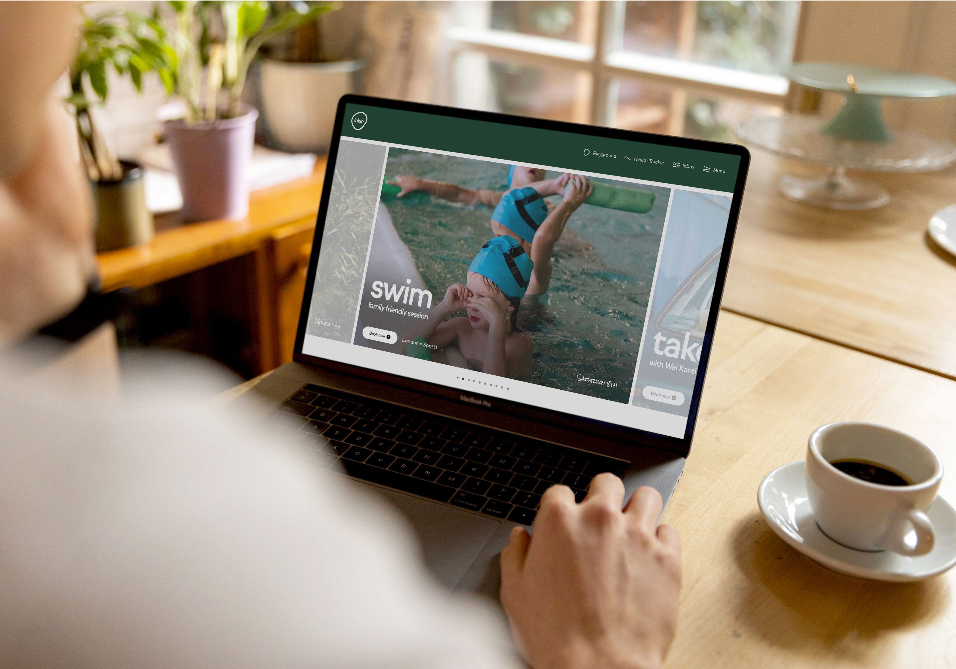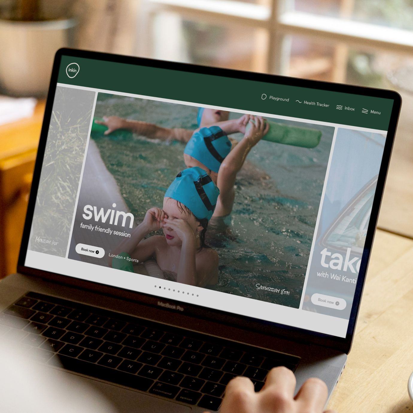
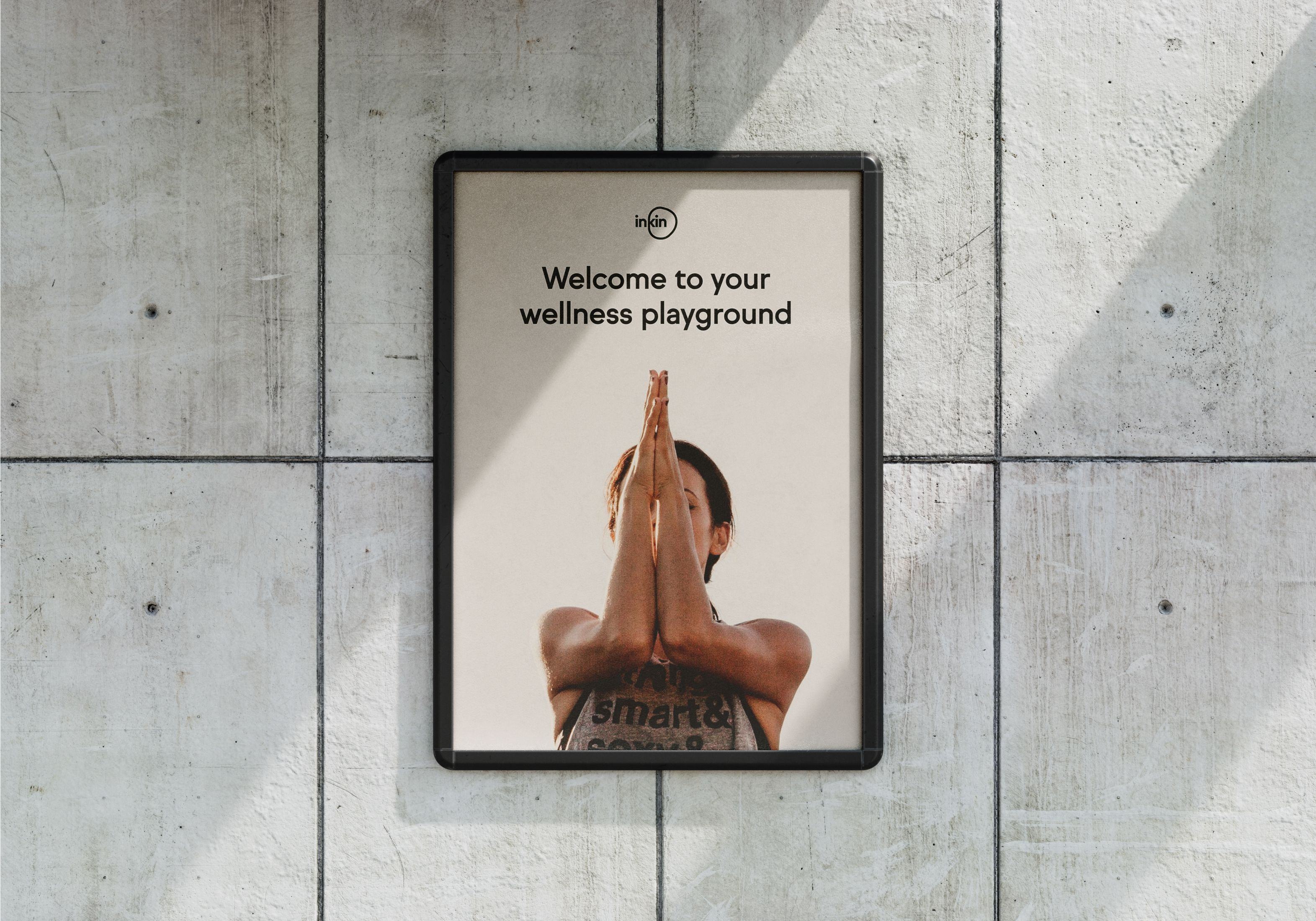
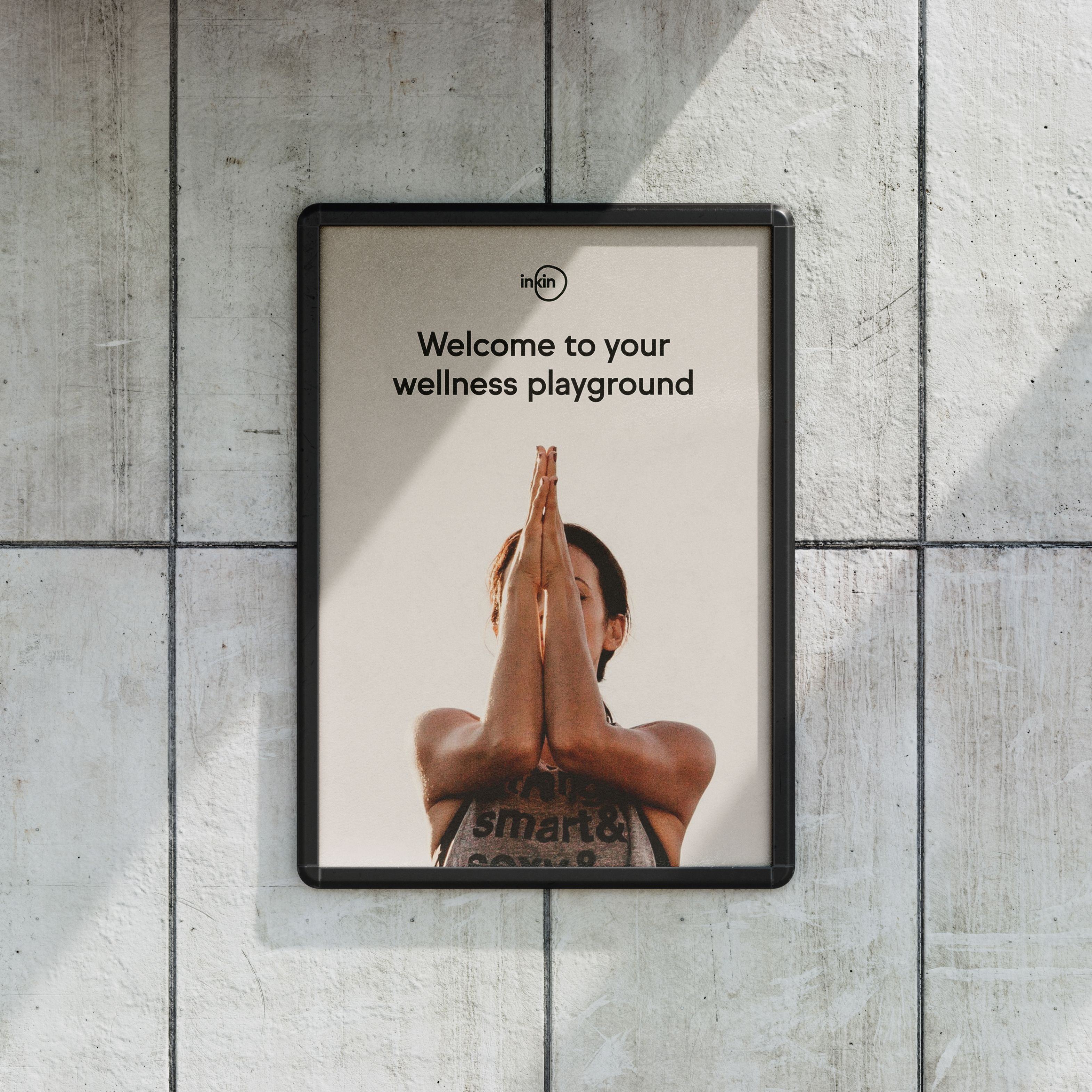
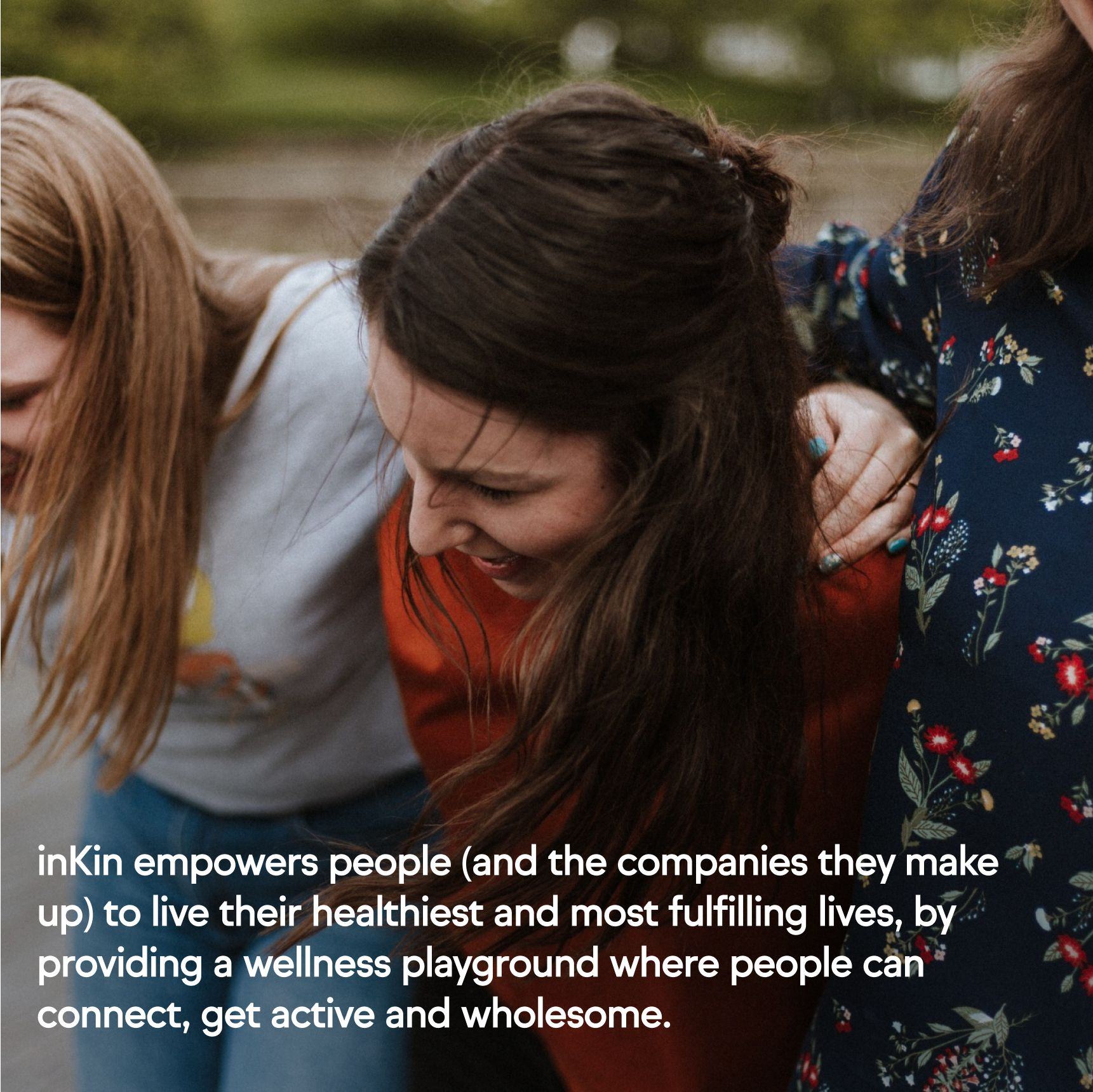
inKin is a wellness platform for teams of any size, that promotes health & belonging for individuals - rather than metrics for corporations.


Context.
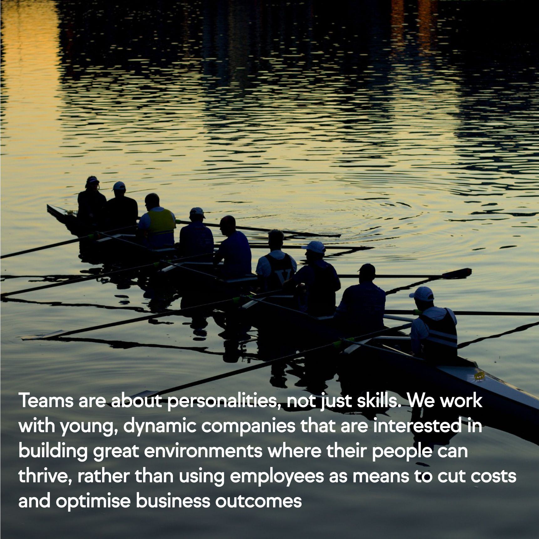
Although an established corporate wellness provider with Uber, PayPal and Google under their belt, inKin struggled with building brand loyalty and securing new customers. Our brief was to create an authentic brand with a new positioning and vision, mission and values, visual and verbal identities, that would empower inKin to find their distinct place on the booming market of corporate wellness.
Strategy.
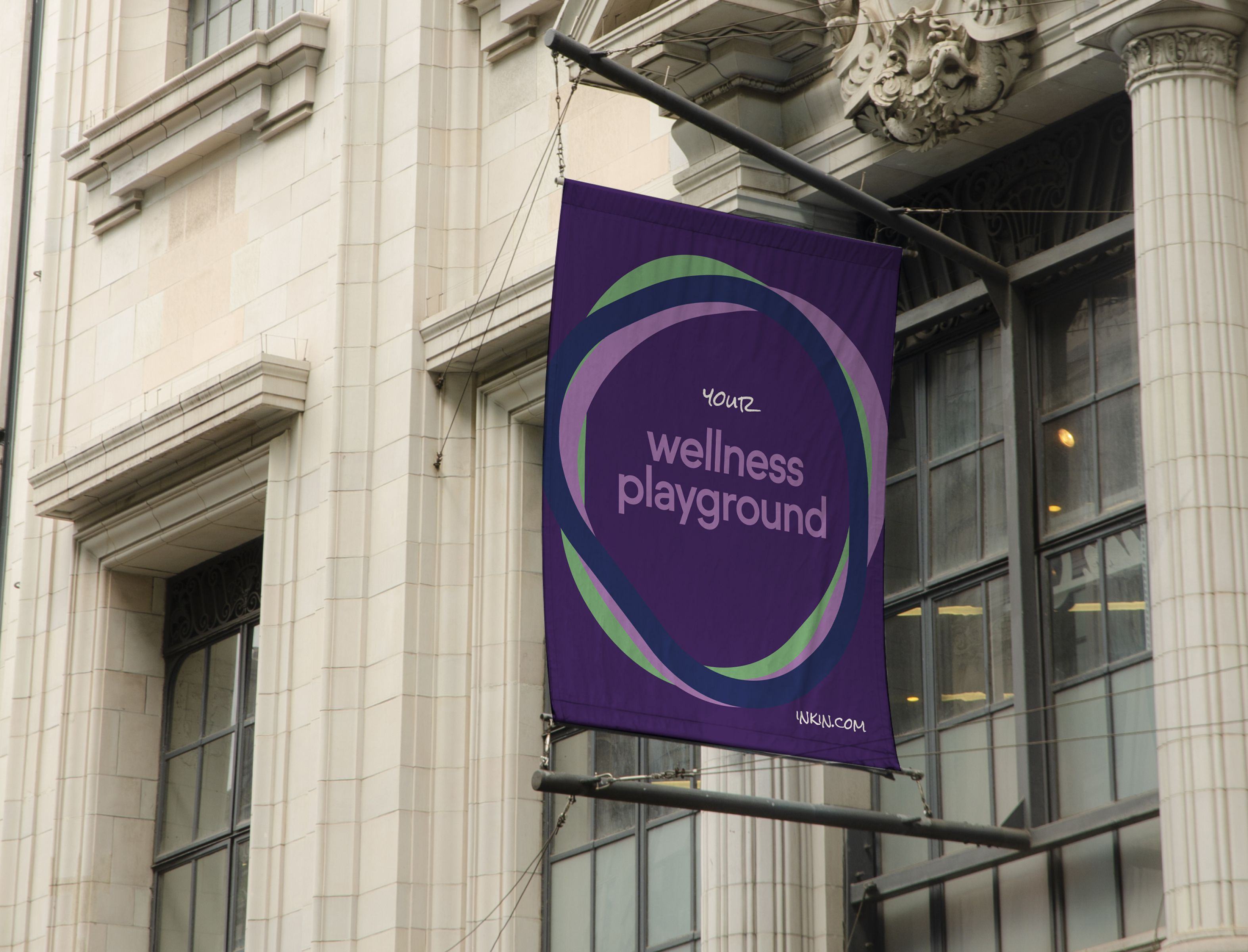
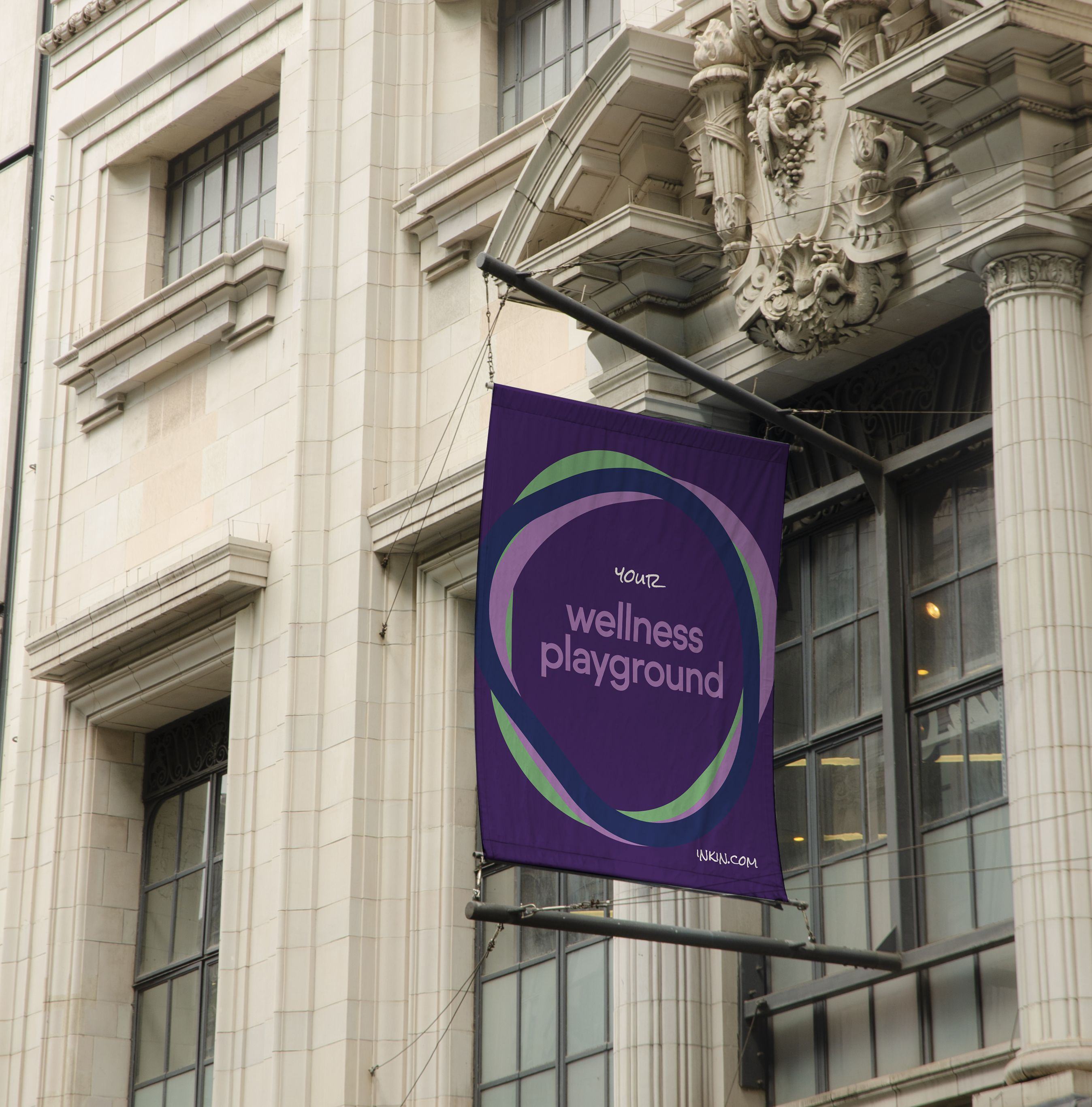
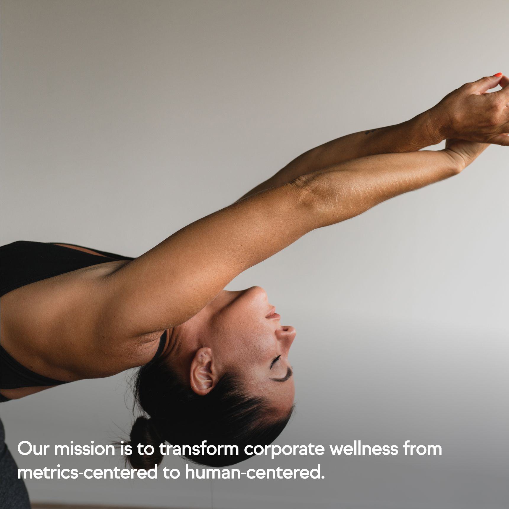
Using our research findings, we decided to embrace a bold new brand mission: to transform corporate wellness from metrics-centered to human-centered; and arrived at a new positioning and vision for the product, centered around belonging, community and a holistic approach to wellness. “Think of inKin as an open space filled with a variety of tools and activities across different aspects of wellbeing, where anyone can create a shared experience allowing members to feel more connected to each other and their community, online and in person.”
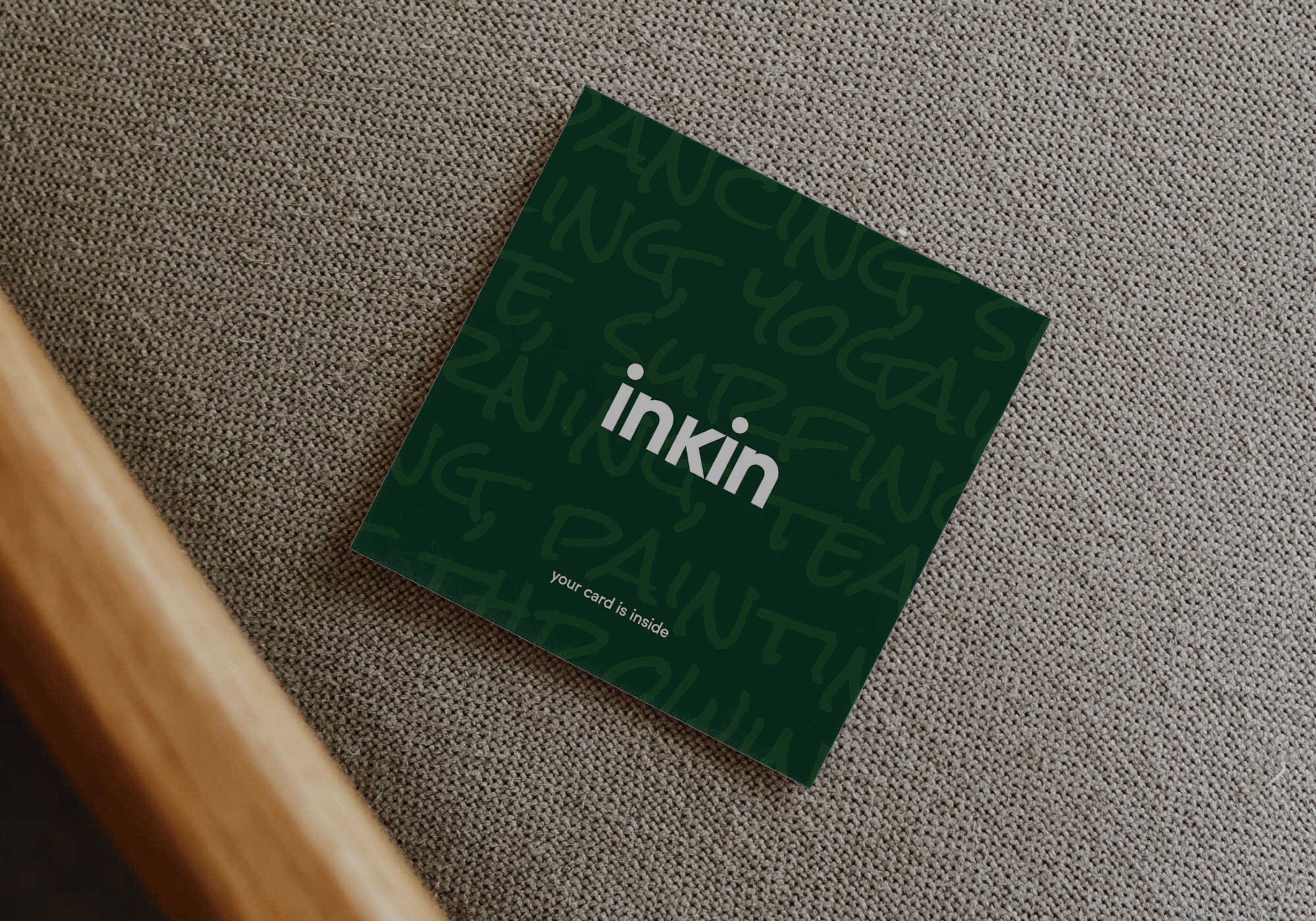
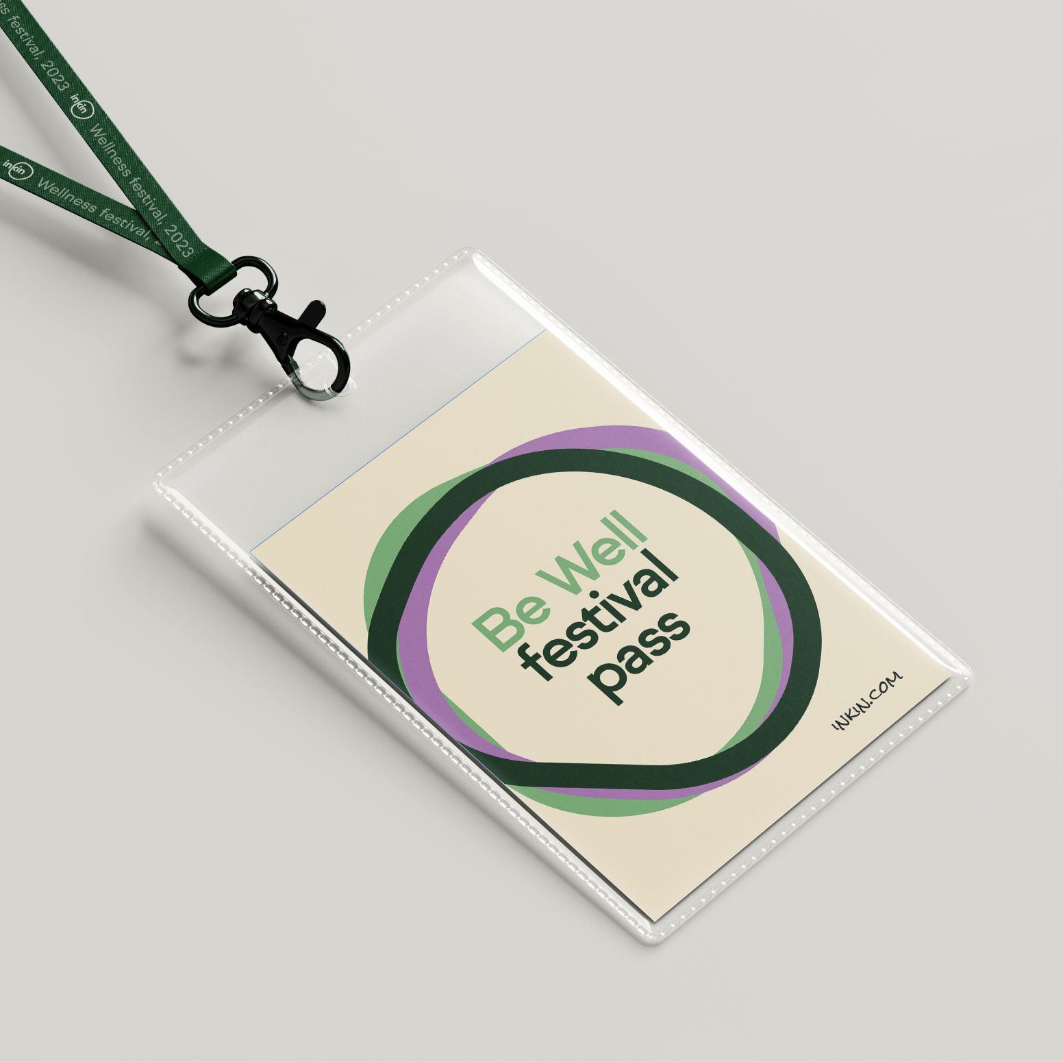
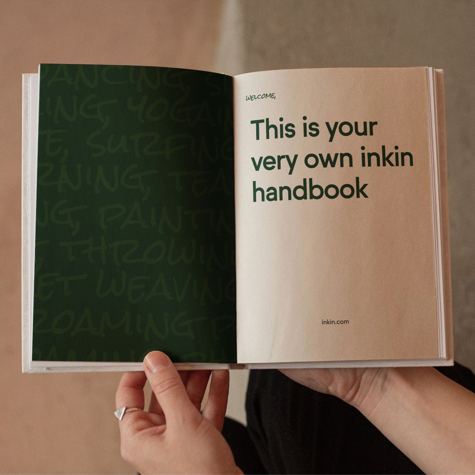
Identity.
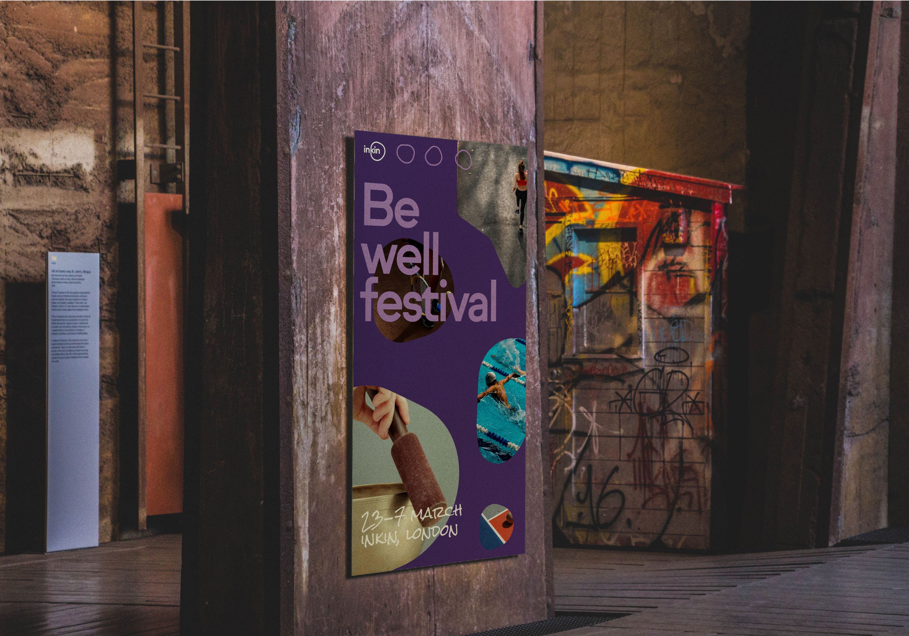
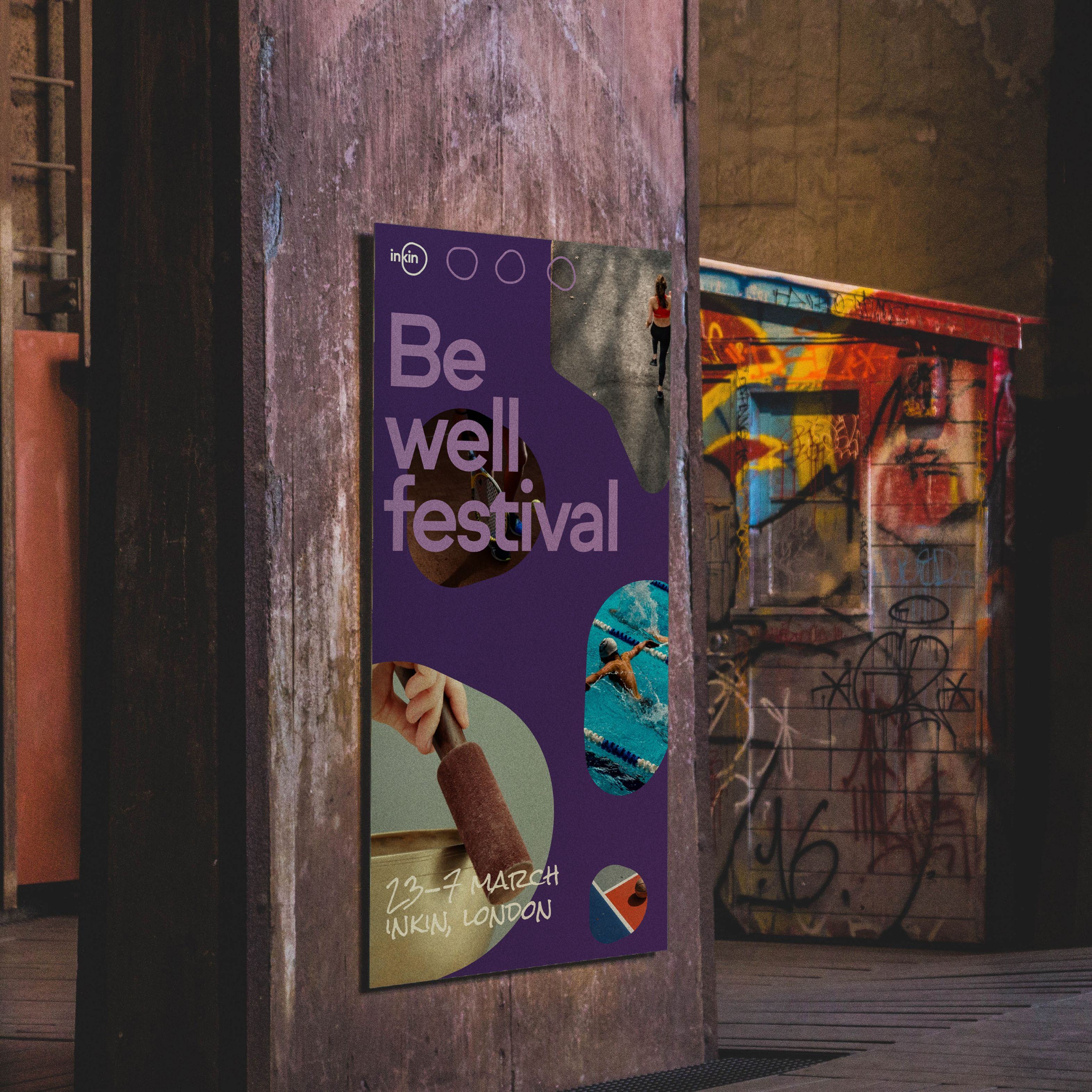
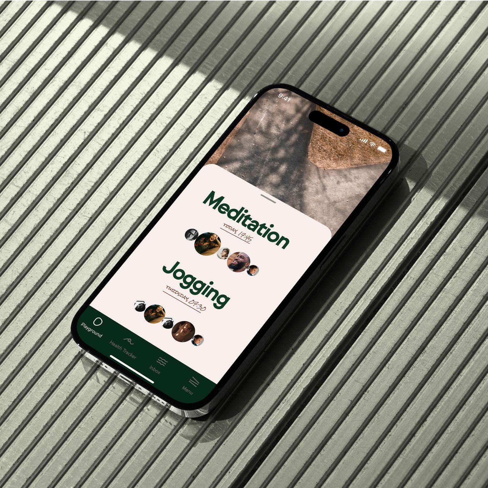
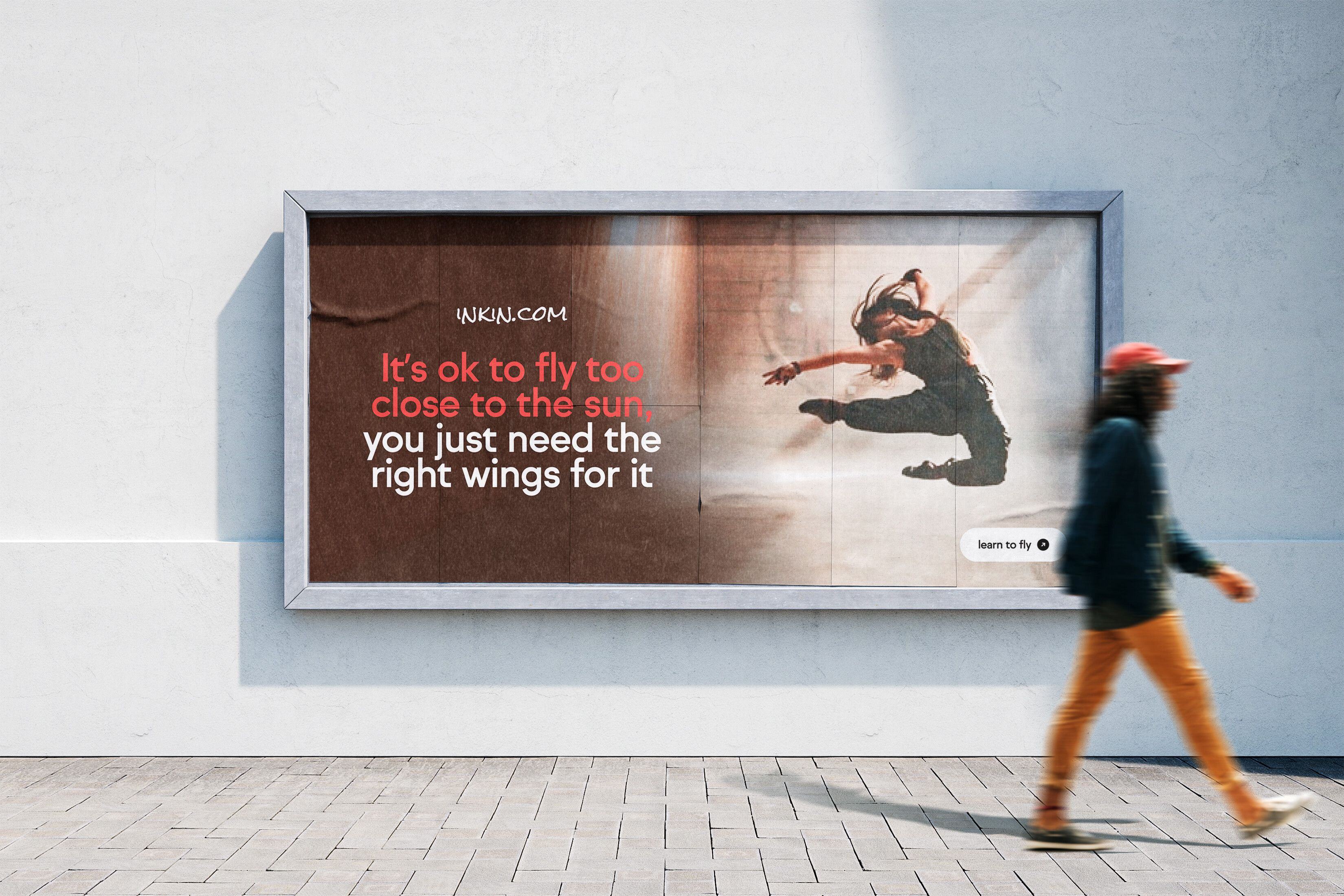
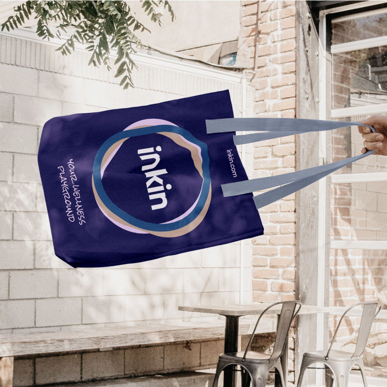
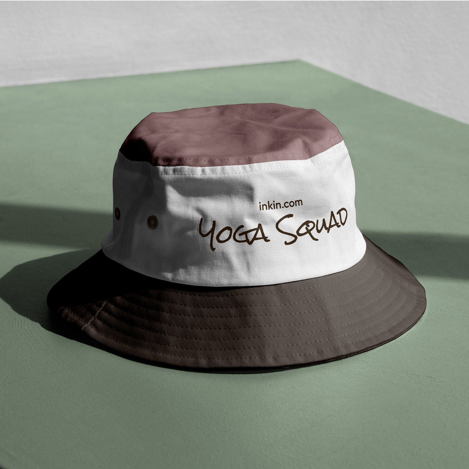
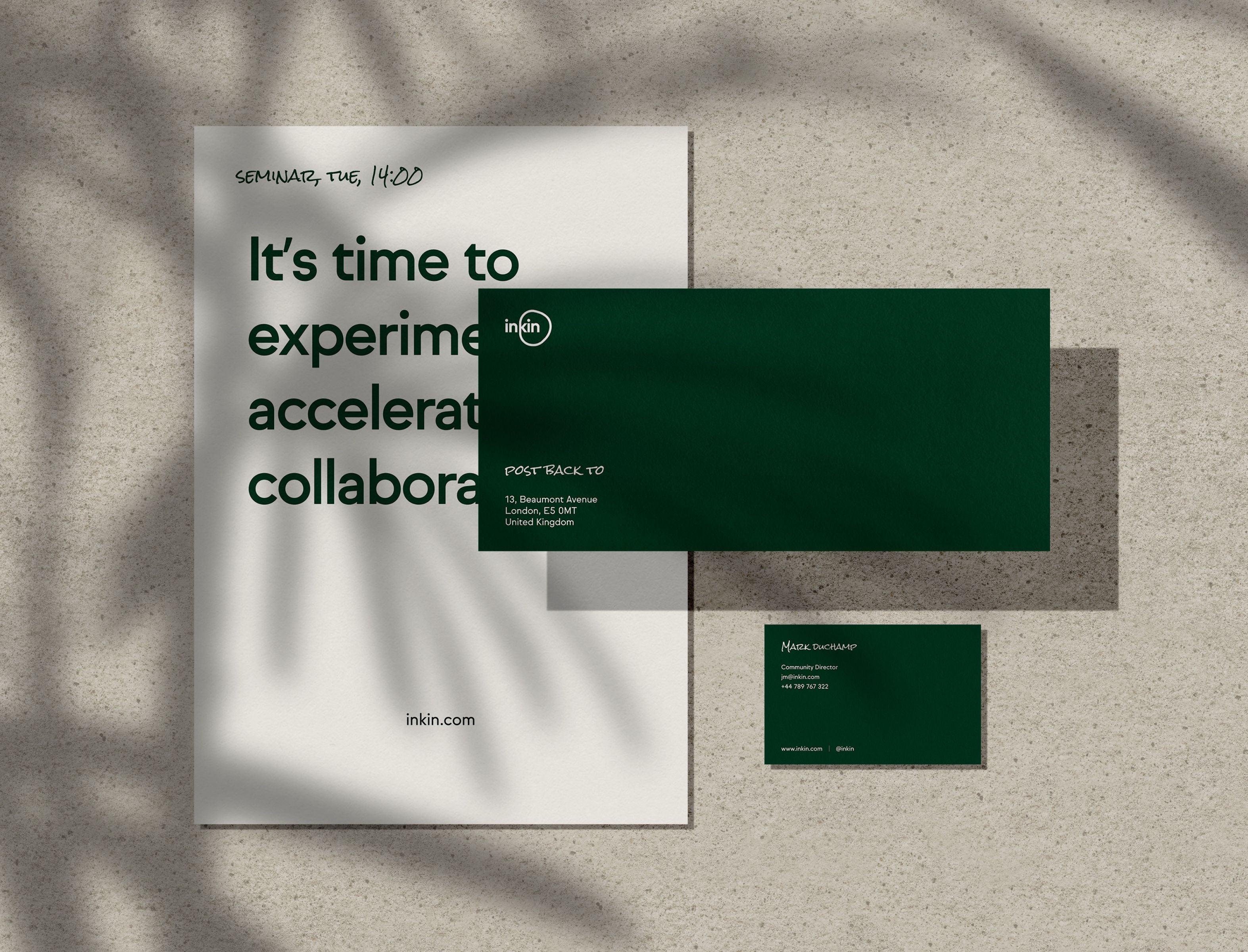
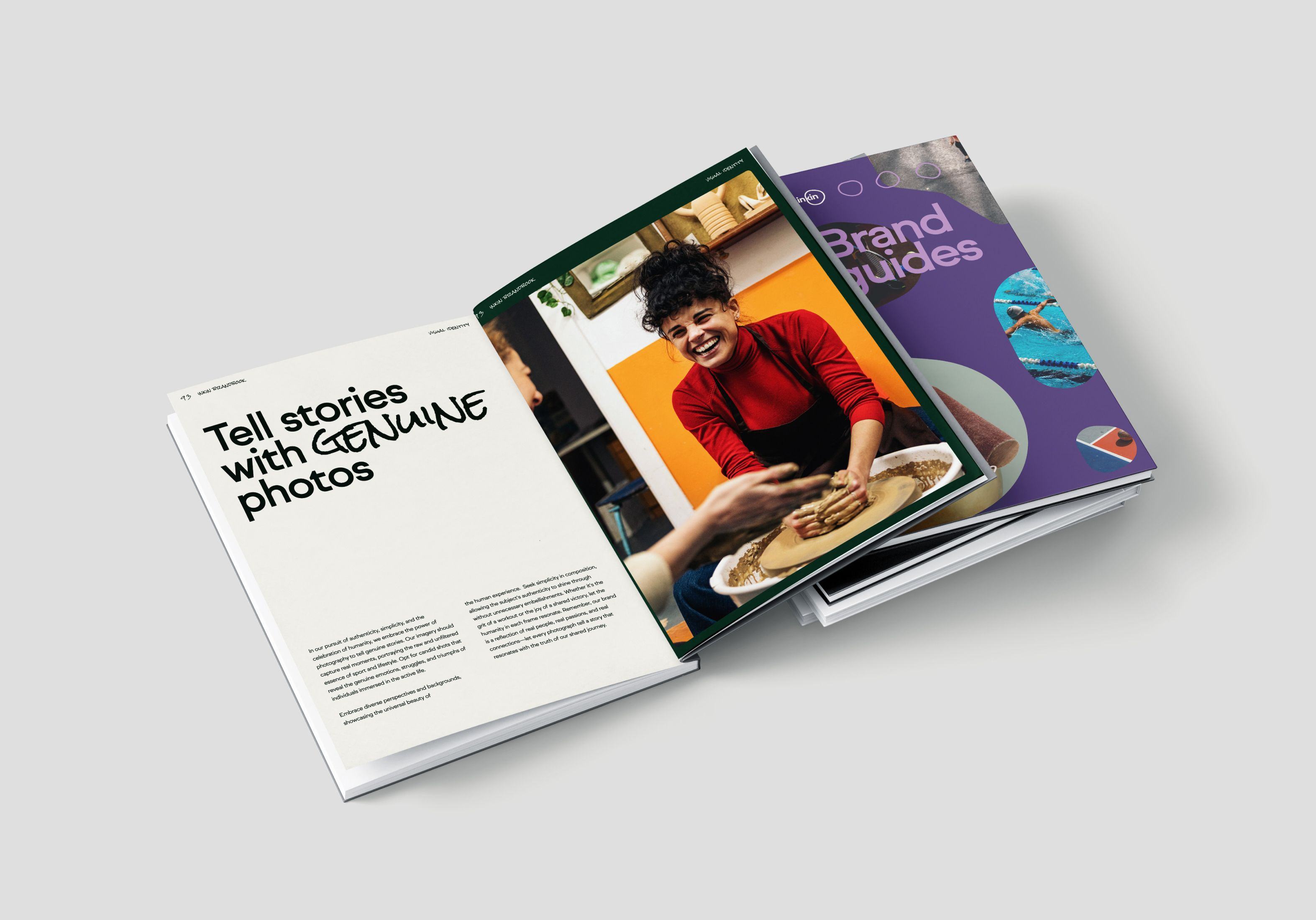
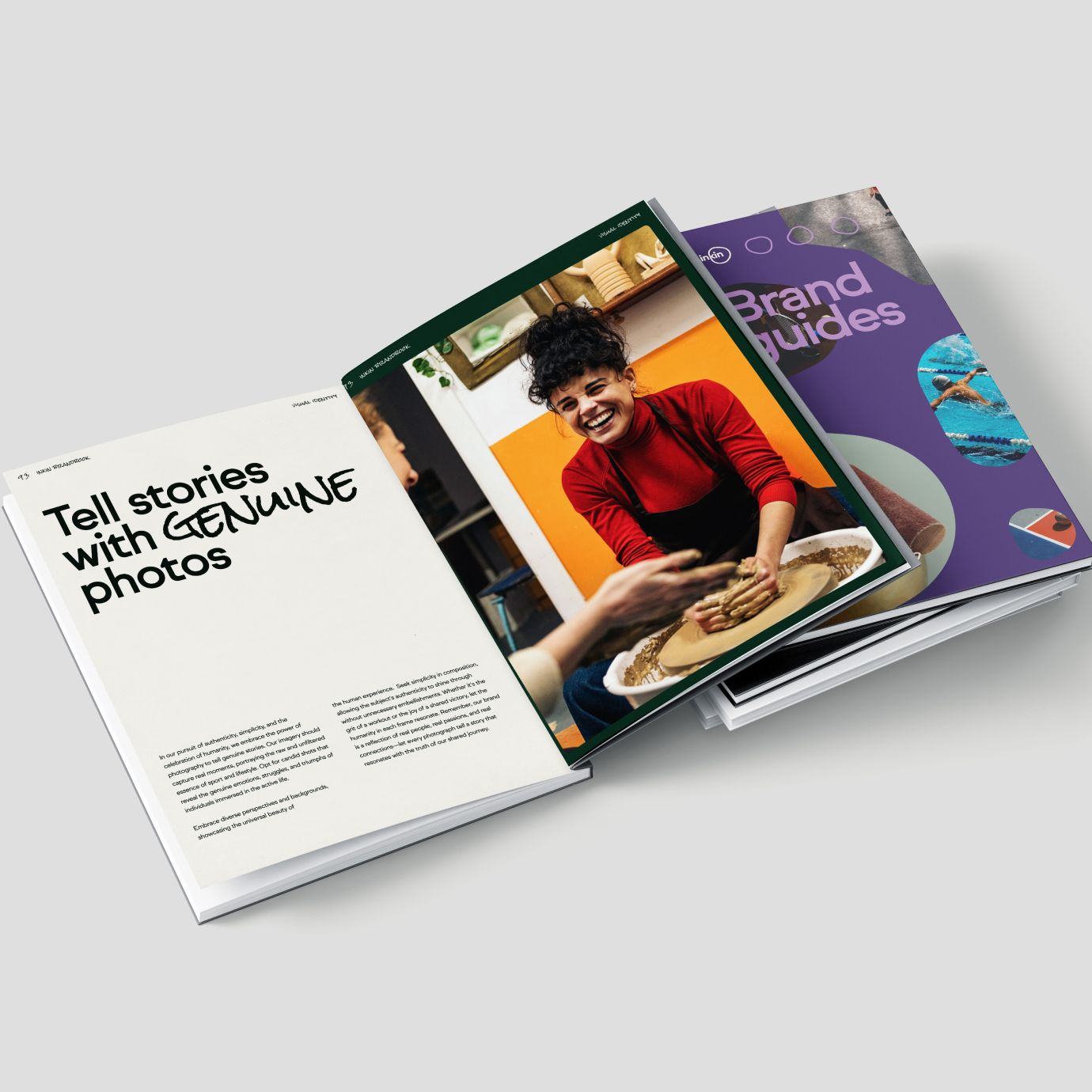
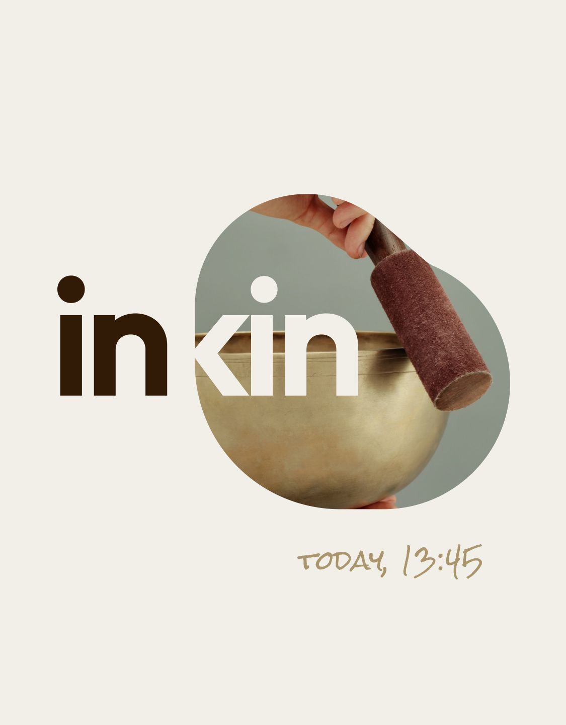
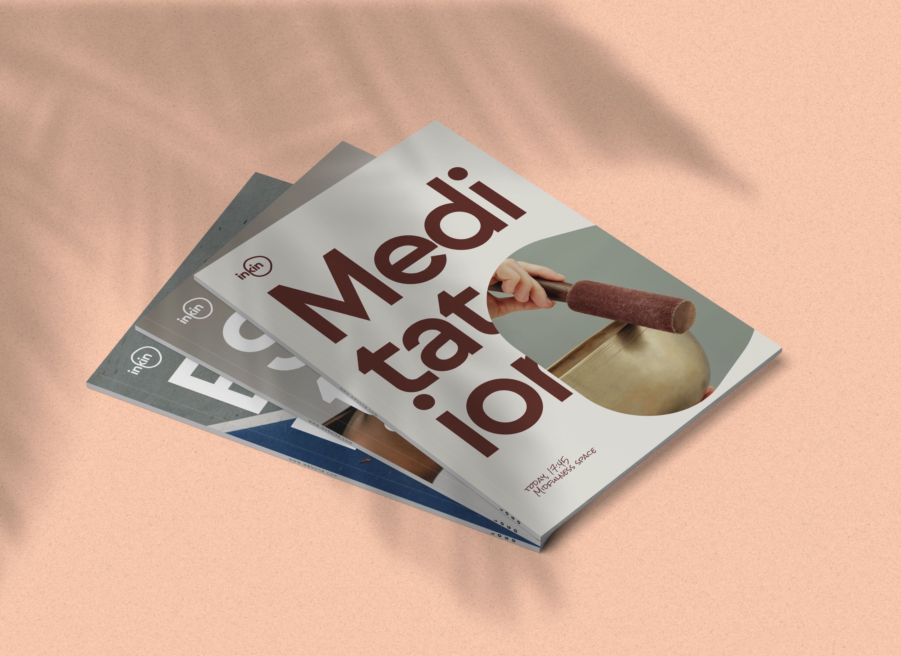
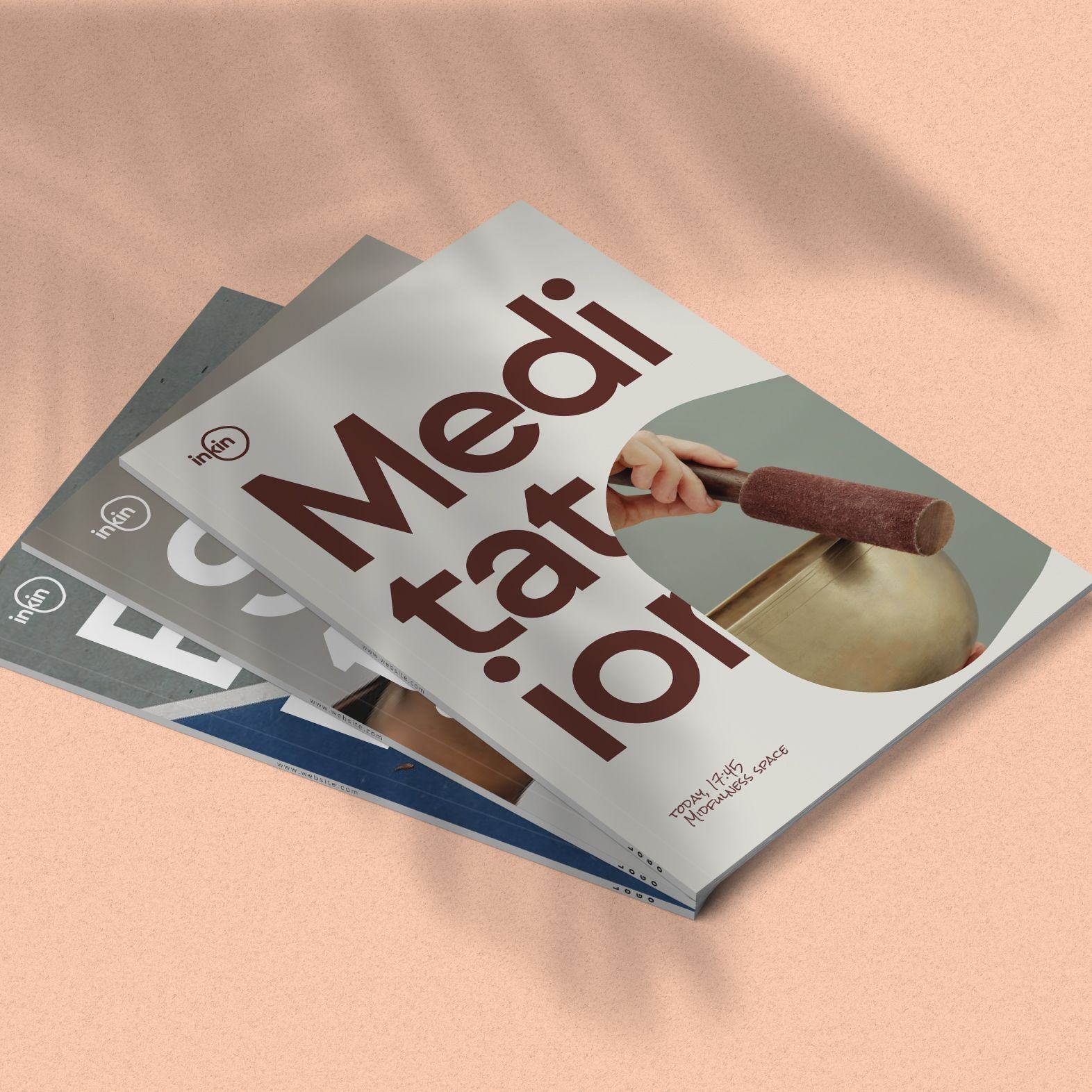
Reimagining inKin as a playground, we turned to urban design & architecture for visual inspiration. Behind the logo is the idea of an open space that changes and adapts to the activities and groups within it - as any functional public space should. Our aim was to establish a sense of openness to change, a free environment where every team member can be themselves - which is what inKin is all about: flexibility, curiosity, personality. Seeing typography as a wayfinding mechanism within the playground we chose Sul Sans, a geometrically constructed font used on signs and buildings in Portugal.