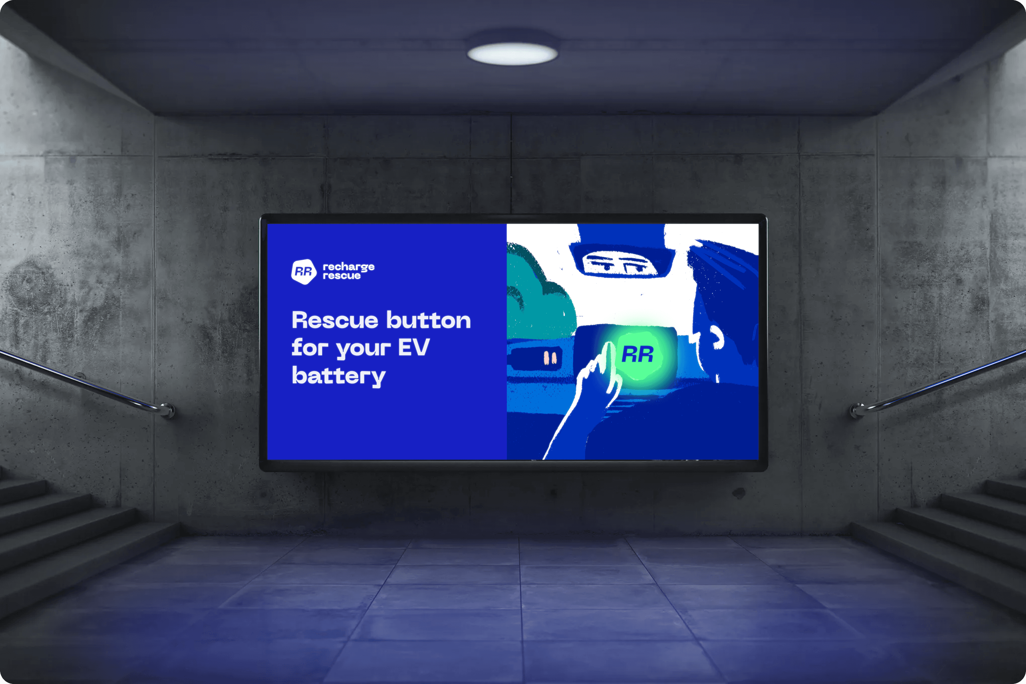
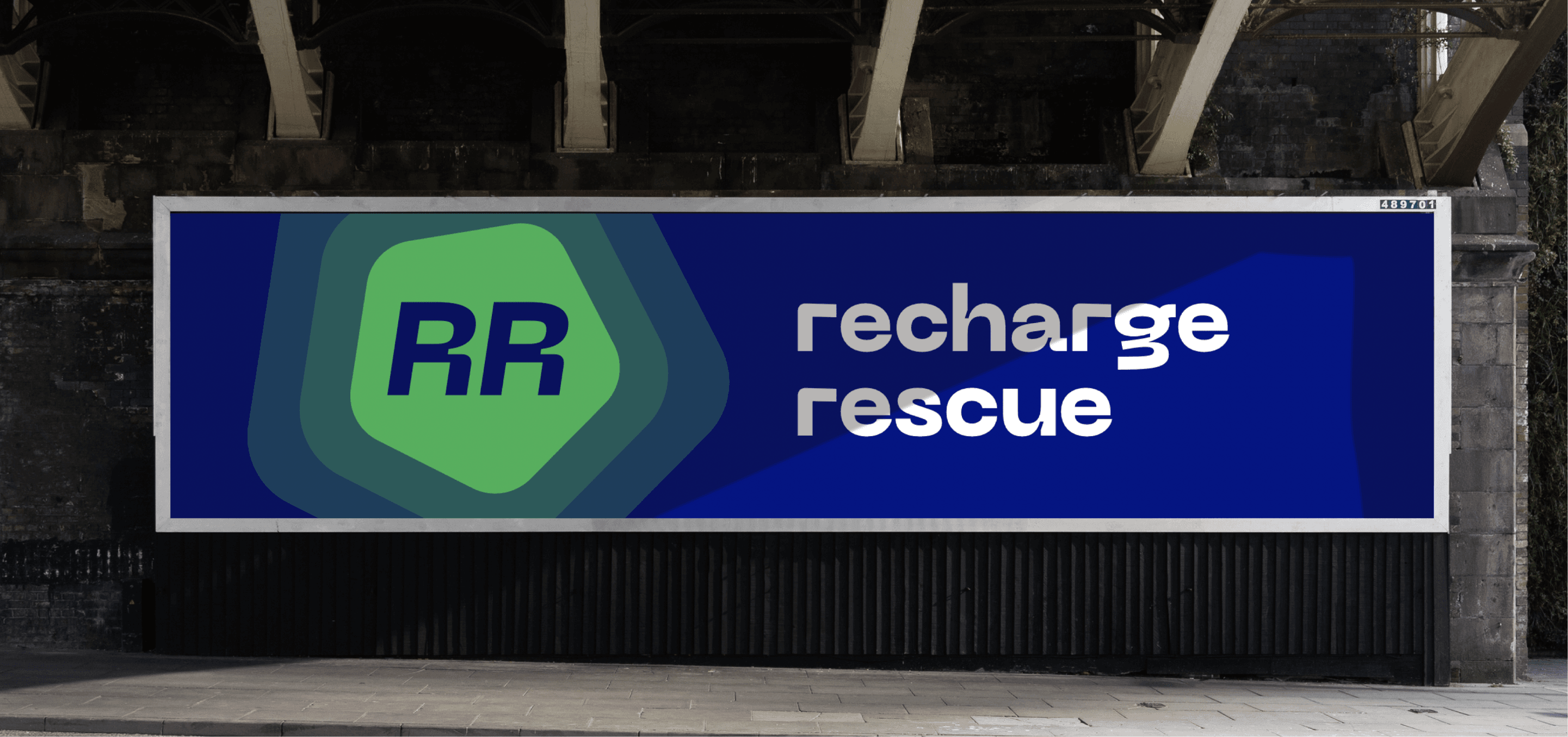
Elegantly minimalist and vibrant brand identity for Recharge Rescue - an exciting new player on the electric vehicle scene in the UK. Stranded without charge? Hit the rescue button.
The search.
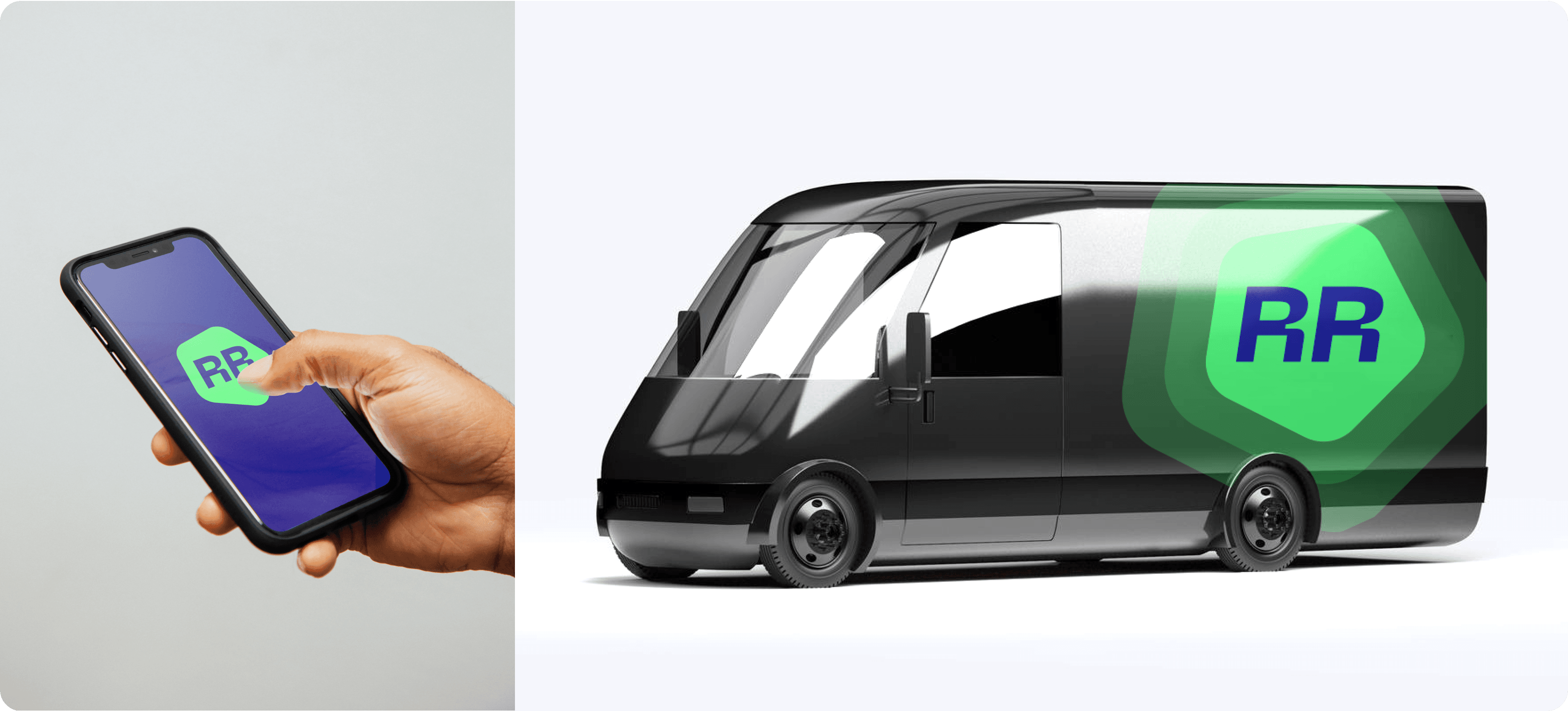
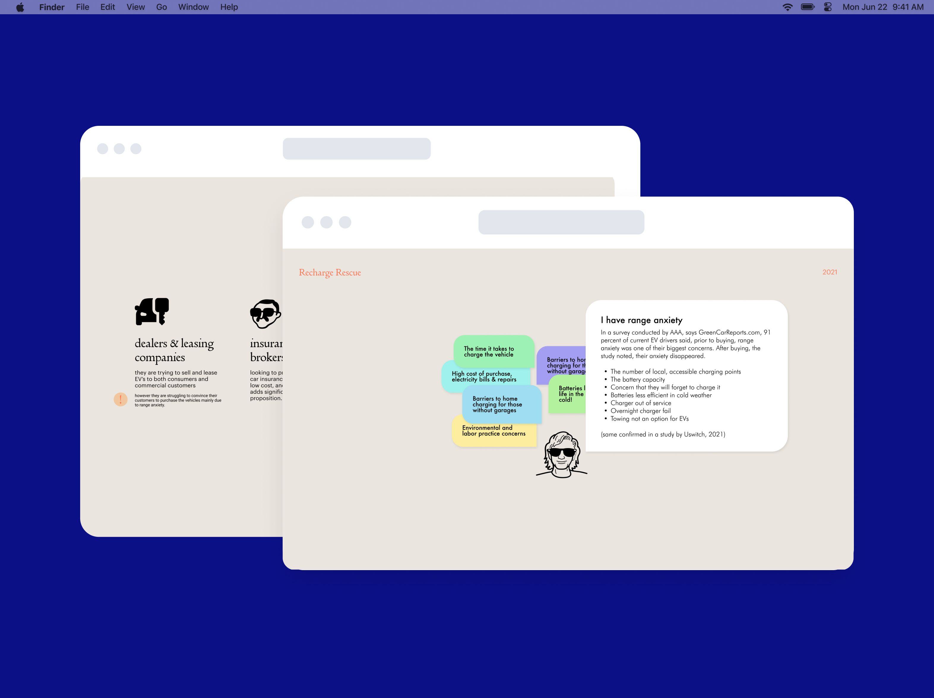
Recharge Rescue was formed as a result of the rapidly shifting trends towards the mainstream adoption of electric vehicles and the practical concerns over the limited range that these battery powered vehicles currently enjoy. Following research into the market and audience expectations, we developed a vision for the brand as a physical rescue button that stranded drivers hit when in emergency - and salvation comes, like Batman, when his (or her) symbol appears in the sky.
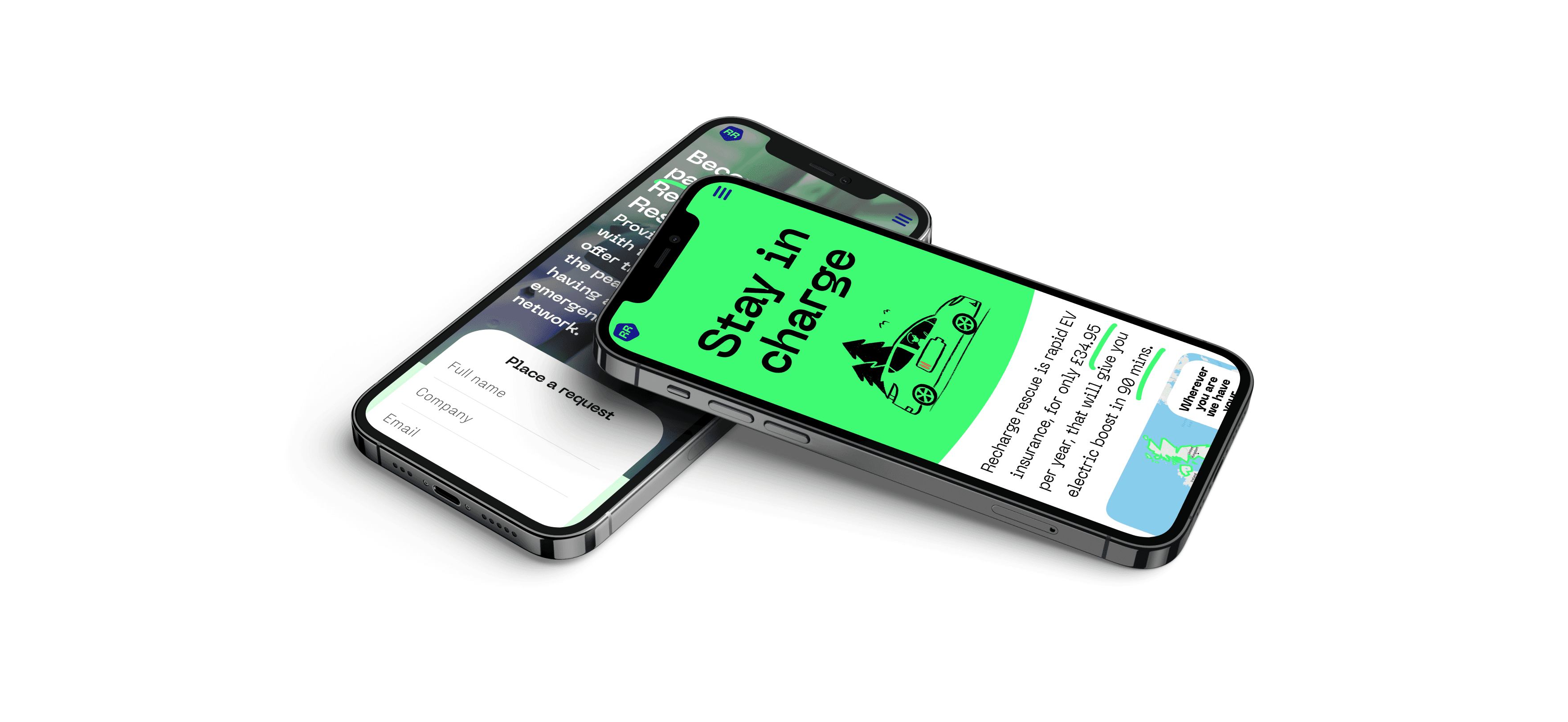
Stay in charge.
Inspired by the vision of RR as a rescue button, we came up with a catchy brand tagline - “Stay in Charge” - and all the key visual choices followed naturally: the button-like symbol for the logo, the popping colour palette and the typography that alludes to the automotive industry.